Plotly Notebook Interactive Time Series
Overview
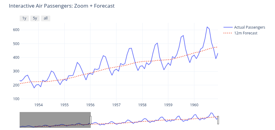
Using Plotly’s interactive time-series interface within a notebook allows deep-diving into data via browser-based zooming and sliders. In this template, we explore the classic Air Passengers toy dataset (1949-1960) and overlay a 12-month trend forecast to visualize long-term growth. This can easily be scaled up to millions of data points, allowing you to comfortably plot centuries of daily data without performance drops.
Why use this template?
Use this template as a quick start to build your own interactive time-series analysis by just editing or replacing the included dataset with your own. You can use the code as is, or modify it to your needs. Before that, learn and see how the template works.
Getting Started
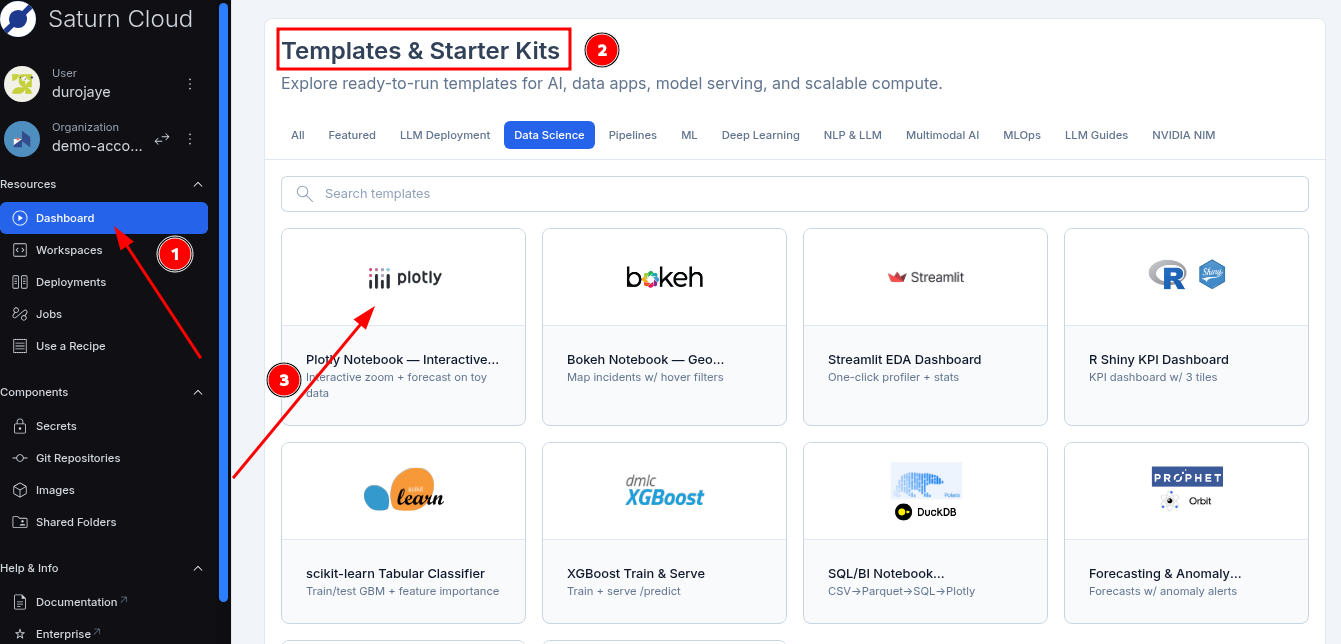
- Simply log in to Saturn Cloud.
- Click on the dashboard in the top-left sidebar.
- Scroll down to the Templates & Starter Kits section
- Select the Data Science and Analytics category
- Click on plotly notebook.
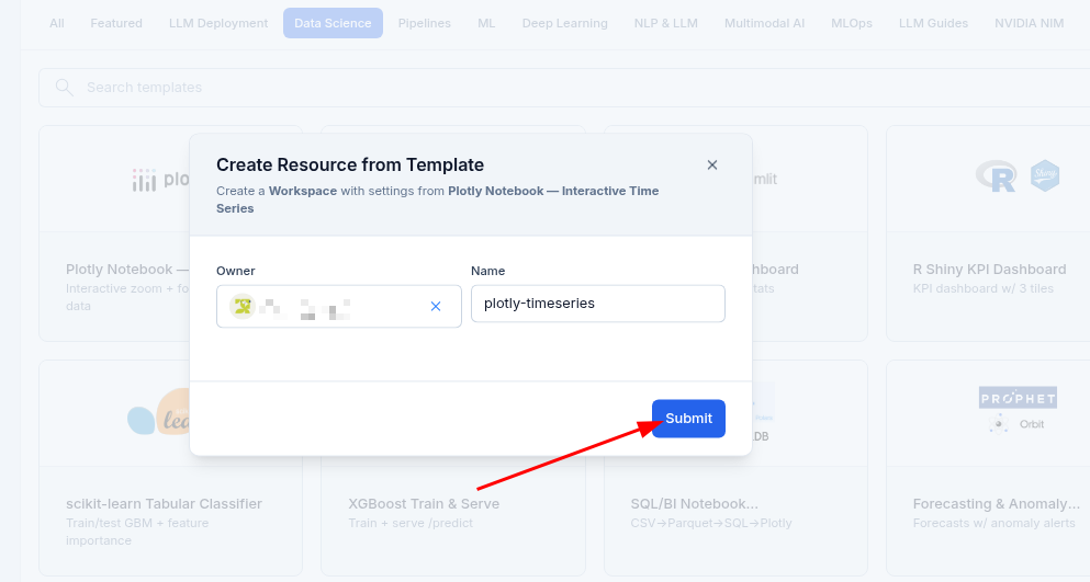
- In the Create Resource from Template modal, click Submit.
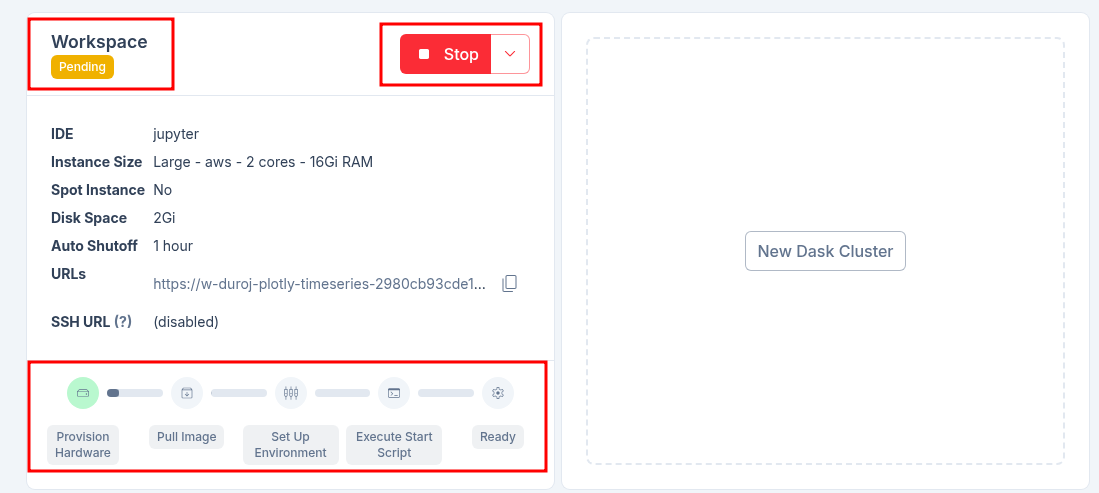
- After clicking on the Submit button, you will be taken to the Workspace page where all the configuration about the resource is located. From there, you click on the start button to start the template.
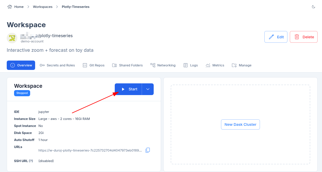
- The resource takes a few minutes to start and provision all the necessary software. The software bar will gradually fill up at the bottom of the resource information box.
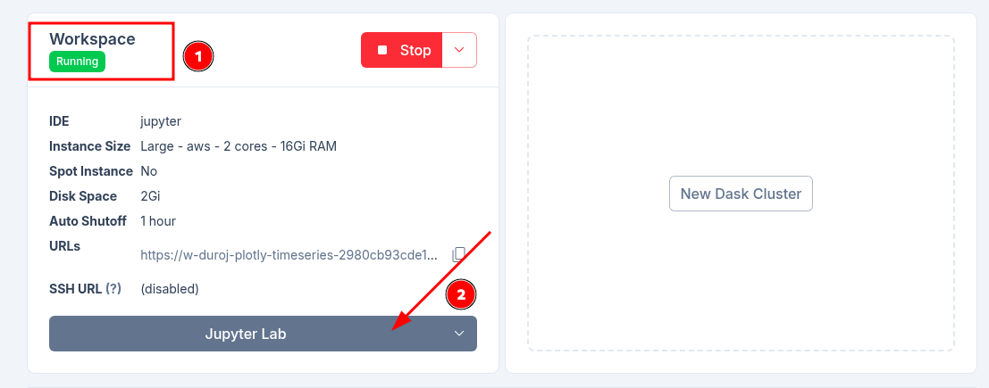
- Once the template resource is running, you can click on the JupyterLab tab to open the notebook and begin your analysis.
Note: A new tab will open with the notebook, as seen in the image below.
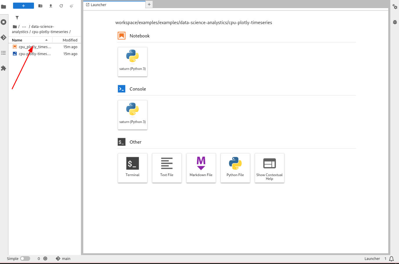
- In JupyterLab, double-click the notebook file in the left sidebar to open it. Then, press Run All in the top menu to execute the code and view the interactive time series.
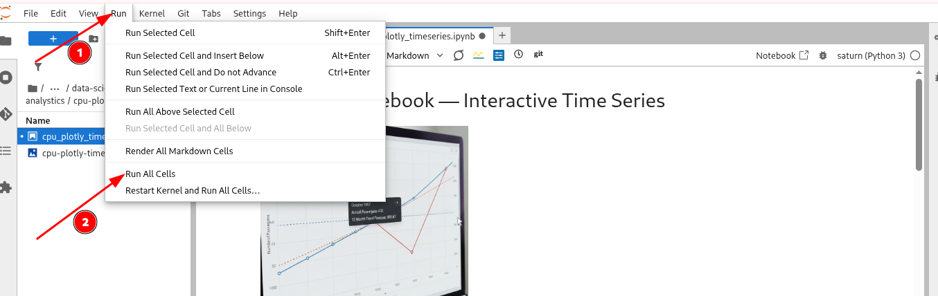
- Once the execution completes, the interactive Plotly graph will render directly in the notebook for you to explore.
What to Expect in the Notebook
The included notebook is self-contained and fully documented. Its workflow guides you through:
- Dependency Management: Installing necessary libraries (
plotly,pandas,ipywidgets) into your active environment. - Data Ingestion: Fetching the sample dataset and parsing temporal features.
- Trend Analysis: Computing rolling averages to establish baselines.
- Interactive Rendering: Outputting the final Plotly visualization with embedded range sliders and hover capabilities.
Troubleshooting & Best Practices
When working with enterprise data, keep these tips in mind:
Widgets Not Rendering: If the graph area is blank, change your final code from
fig.show()tofig.show(renderer="iframe")to force the widget to display.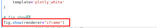
Out-Of-Memory Errors: For massive datasets, edit your resource in the Saturn Cloud Workspace to provision more RAM.
Kernel Crashes: Check the Saturn Cloud UI resource logs to see if memory limits were exceeded.
Key Features
- Interactive Exploration: Use built-in Plotly features like range sliders, zoom, and unified hover tooltips to deeply analyze the dataset.
- Time-Series Focus: Learn how to parse dates as indices using Pandas for accurate chronological plotting.
- Trend Smoothing: Easily generate and overlay rolling averages to extract long-term trends from seasonal noise.
- Zero Hardware Hassle: Fully optimized to run smoothly on standard CPU resources within Saturn Cloud.
Conclusion
This template demonstrates how to quickly build interactive time-series visualizations using Plotly and Pandas. You can easily swap the sample dataset for your own, apply advanced forecasting models, and explore your data directly within Saturn Cloud.
Resources and Support:
- Platform: Saturn Cloud Dashboard
- Support: Saturn Cloud Documentation
- Library: Plotly Python Documentation