
This article was published when data science tooling like Dask and R was a primary focus for Saturn Cloud. Today, Saturn Cloud is the enterprise AI platform for any GPU infrastructure.
Getting started
First, we need to install the necessary packages. We will use Pandas for data manipulation, Matplotlib for data visualization, and Scikit-Learn for machine learning. To install these packages, we can use the following command in the terminal:
pip install pandas matplotlib scikit-learn
Let’s start the jupyter notebook on your terminal
jupyter notebook
After installing the necessary packages, we can create a new Jupyter Notebook and import the packages in the first code cell. The Pandas library is imported using the alias pd, while the Matplotlib pyplot module is imported using the alias plt. The Scikit-Learn library is also imported to load the Iris dataset.
Saturn Cloud offers seamless collaboration with cloud-based Jupyter notebooks designed for smooth teamwork and high-performance computing. Get started for free here.
Import packages
import pandas as pd
import matplotlib.pyplot as plt
from sklearn.datasets import load_iris
In this tutorial, we will use the Iris dataset for the EDA task and we will learn how to build a simple machine learning model using this dataset. We can load the Iris dataset using the load_iris function from Scikit-Learn which returns an object containing several attributes. The iris object contains the data, target, and feature names, which we can use to create a Pandas DataFrame:
iris = load_iris()
The iris object contains several attributes, including the data (iris.data), the target (iris.target), and the feature names (iris.feature_names). To work with the data, we can create a Pandas DataFrame from the data using pd.DataFrame(). We set the column names of the DataFrame to the feature names using columns=iris.feature_names. This creates a DataFrame with columns for each measurement and rows for each flower.
Create pandas DataFrame from the data and use feature names as collumn names
df = pd.DataFrame(iris.data, columns=iris.feature_names)
Exploring the data
After loading the Iris dataset into a Pandas DataFrame, we can explore the data to get a better understanding of it. We can start by checking the shape of the DataFrame
Check the shape of the data
print(df.shape)
The output is (150, 4), which means that we have 150 rows and 4 columns.
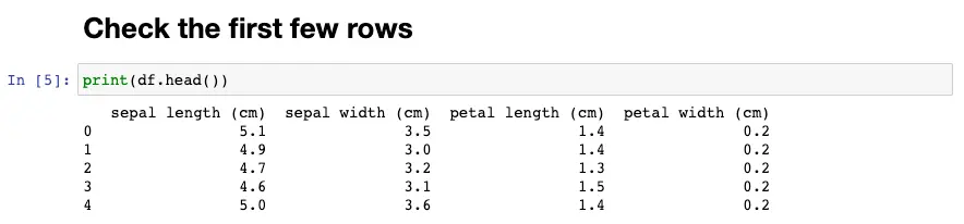
Next, we can check the first few rows of the DataFrame using the head method. The number of rows to shown is 5 as default, you can change the number of rows to show by enter the desired number to head method, i.e df.head(10)
Check the first few rows
df.head()
To gain more insights into the data, we can use the describe method to get the summary statistics of the DataFrame. This method gives us information on the count, mean, standard deviation, minimum, maximum, and quartile values of the data. The output of the describe method helps us to see if there are any missing values, outliers, or extreme values in the dataset.
df.describe()
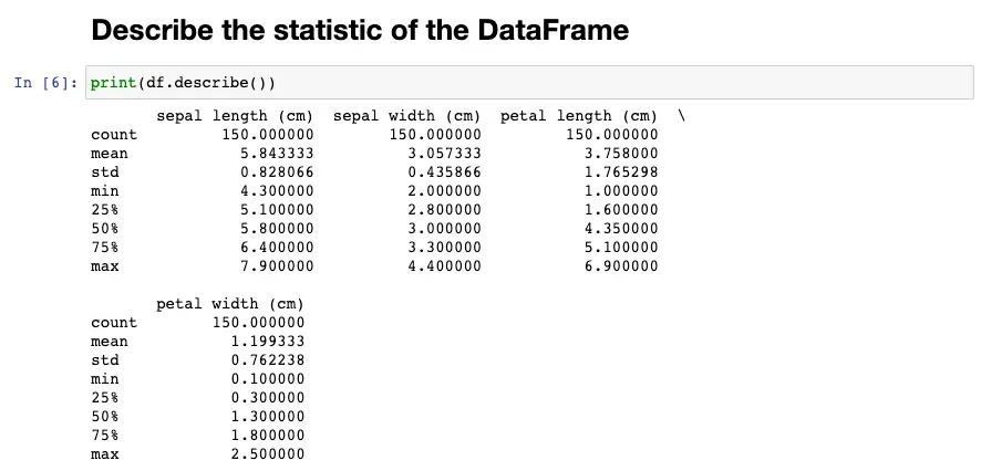
For each numerical column, it displays the count (number of non-null values), mean, standard deviation, minimum value, 25th percentile, 50th percentile (median), 75th percentile, and maximum value.
For example, for the column sepal length (cm), the describe() method output shows that there are 150 non-null values in this column. The mean sepal length is 5.84 cm, with a standard deviation of 0.83 cm. The shortest sepal length is 4.3 cm, and the longest is 7.9 cm. The 25th percentile is 5.1 cm, which means that 25% of the sepal lengths are below 5.1 cm, and 75% are above 5.1 cm. The 50th percentile (median) is 5.8 cm, which means that 50% of the sepal lengths are below 5.8 cm and 50% are above 5.8 cm. The 75th percentile is 6.4 cm, which means that 75% of the sepal lengths are below 6.4 cm, and 25% are above 6.4 cm.
Univariate Analysis
Univariate analysis is the simplest form of analysis, where we examine each variable individually. Let’s start by looking at the distribution of each feature in the dataset. We can use histograms to visualize the distribution of each feature.
fig, axes = plt.subplots(2, 2, figsize=(10,8))

for i, ax in enumerate(axes.ravel()):
    ax.hist(df.iloc[:, i], bins=15)
    ax.set_xlabel(df.columns[i])
    ax.set_ylabel('Frequency')
    ax.axvline(df.iloc[:, i].mean(), color='r', linestyle='dashed', linewidth=1)
    ax.axvline(df.iloc[:, i].median(), color='g', linestyle='dashed', linewidth=1)

plt.show()
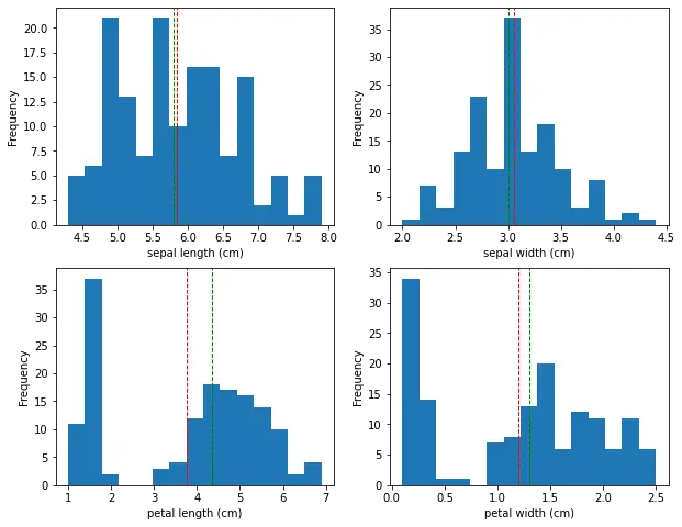
This will create a 2x2 grid of histograms, one for each feature. We can see that the sepal width feature has a relatively normal distribution, while the other features have a bimodal distribution.
The histogram shows show the distribution of the sepal and petal length and width of the iris flowers. In this case, the x-axis represents the range of the size values, while the y-axis represents the frequency of those values.
The histogram shows that the sepal length values are distributed across a range of approximately 4.3 to 7.9 cm. The peak of the distribution is around 5.0-5.5 cm, which indicates that a large number of flowers have a sepal length in this range. The histogram also shows that the distribution is roughly symmetric, with a slight skew towards longer sepal lengths. Same for sepal width, petal length and petal width.
Bivariate Analysis
Bivariate analysis involves analyzing the relationship between two variables. We can use scatter plots to visualize the relationship between each pair of features.
import seaborn as sns
df['target'] = iris.target
sns.FacetGrid(df,hue="target",size=5).map(plt.scatter,"sepal length (cm)","sepal width (cm)").add_legend()
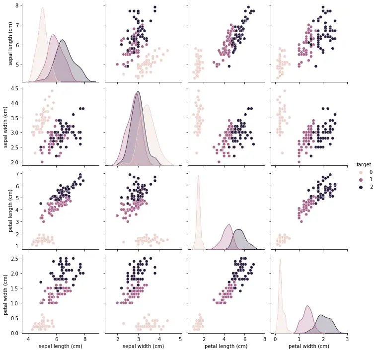
This will create a pair plot, where each scatter plot shows the relationship between two features. The color of the points in the scatter plot corresponds to the different species of iris.
From the pair plot, we can see that there is a strong linear relationship between petal length and petal width, and we can use this to distinguish between the different species of iris.
Multivariate Analysis
Multivariate analysis involves analyzing the relationship between three or more variables. We can use scatter matrix plots to visualize the relationship between each pair of features, along with the distribution of each feature.
sns.scatterplot(data=df, x="petal length (cm)", y="petal width (cm)", hue="target")
plt.show()
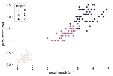
This will create a scatter plot with petal length on the x-axis and petal width on the y-axis, with different colors representing the different species of iris.
We can also use a heatmap to visualize the correlation matrix of the dataset.
dfx = df.drop(columns=['target'])
sns.heatmap(dfx.corr(), annot=True, cmap='Blues')
plt.show()
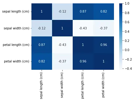
This will create a heatmap showing the correlation between each pair of features. We can see that petal length and petal width are highly correlated, while sepal length and sepal width are not strongly correlated.
Visualizing the Data
EDA is not complete without visualizing the data. Visualizing the data can help us understand the relationships between variables and identify patterns that may not be apparent in the summary statistics. In the case of the Iris dataset, we can use scatter plots to visualize the relationship between the sepal length and width and the petal length and width. We can also use color to represent the different plant species. The plots should show clear clusters of different colors, indicating that the different plant species can be distinguished based on their measurements.
plt.scatter(df['sepal length (cm)'], df['sepal width (cm)'], c=iris.target)
plt.xlabel('sepal length (cm)')
plt.ylabel('sepal width (cm)')
plt.show()

plt.scatter(df['petal length (cm)'], df['petal width (cm)'], c=iris.target)
plt.xlabel('petal length (cm)')
plt.ylabel('petal width (cm)')
plt.show()
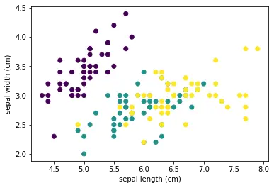
The resulting scatter plots show us the distribution of the data points and the relationships between the variables. For example, in the sepal length vs sepal width plot, we can see that the data points cluster into three distinct groups, one for each plant species. This suggests that the sepal length and width can be used to distinguish between the different plant species.
Similarly, in the petal length vs petal width plot, we can see that the data points cluster into three distinct groups, with a clear separation between each group. This suggests that the petal length and width are highly correlated and can be used to distinguish between the different plant species with even higher accuracy.
By visualizing the data, we can gain insights that may not be apparent from summary statistics alone. We can identify patterns, trends, and outliers that can inform our data analysis and modeling. In this case, the scatter plots confirmed that the Iris dataset is well-suited for classification tasks, and we can use machine learning algorithms to accurately predict the plant species based on their measurements.
Training a Simple Machine Learning Model
Finally, we can train a simple machine learning model to predict the plant species based on their measurements. We will use the K-Nearest Neighbors (KNN) algorithm, which is a simple classification algorithm that works by finding the K nearest data points to a given input and predicting the most common class among them.
First, we need to split the dataset into a training set and a testing set. This is a common technique in machine learning to evaluate the performance of a model on new, unseen data.
The train_test_split() function from scikit-learn library is used to randomly split the data into two sets. The test_size parameter specifies the percentage of data that should be used for testing, while the remaining percentage is used for training. In our example, we used a test size of 0.2, which means that 20% of the data was used for testing, and 80% for training.
Splitting the data into a training set and a testing set helps to prevent overfitting, which is a common problem in machine learning. Overfitting occurs when a model is too complex and fits the training data too closely, leading to poor performance on new, unseen data. By evaluating the model on a testing set, we can get an estimate of how well the model generalizes to new data.
# Split data to train and test set
from sklearn.model_selection import train_test_split

X_train, X_test, y_train, y_test = train_test_split(df, iris.target, test_size=0.2)

# Use KNN as the classifier and fit it with the training data
from sklearn.neighbors import KNeighborsClassifier

knn = KNeighborsClassifier()
knn.fit(X_train, y_train)
The training set is used to train the model, while the testing set is used to evaluate its performance. We fit the model on the training data using the fit() method of the classifier, and then make predictions on the testing data using the predict() method.
# Predict on the test set
from sklearn.metrics import accuracy_score

y_pred = knn.predict(X_test)
accuracy = accuracy_score(y_test, y_pred)
print('Accuracy:', accuracy)
The accuracy of the KNN classifier on the Iris dataset was 0.93, which means that the model correctly predicted the plant species for 93% of the testing data.
This is a high accuracy score and suggests that the KNN classifier is a good model for this dataset. However, it’s important to note that the performance of the model may vary depending on the specific dataset and the choice of hyperparameters.
We can go ahead to visualize y_pred using the scatter function as we did before.
plt.scatter(X_test.iloc[:, 0], X_test.iloc[:, 1], c=y_test, cmap='viridis', label='Ground Truth')

# plot predicted values
plt.scatter(X_test.iloc[:, 0], X_test.iloc[:, 1], c=y_pred, cmap='viridis', marker='x', label='Predicted')

# add plot labels and legend
plt.xlabel('sepal length (cm)')
plt.ylabel('sepal width (cm)')
plt.title('Ground Truth vs Predicted')
plt.legend()

# display plot
plt.show()
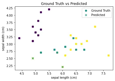
The scatter() function is called twice to plot both the ground truth and predicted values on the same figure. The c argument is used to specify the color of the markers, with cmap=‘viridis’ specifying the color map to use. The marker argument is used to specify the marker style for the predicted values. Finally, labels are added to the plot and a legend is displayed using the legend() function.
Conclusion
In this tutorial, we have shown how to perform EDA using Jupyter Notebook and the Iris dataset. We have explored the data, visualized it using scatter plots, and trained a simple machine learning model to predict the plant species based on their measurements. EDA is a crucial step in data science and machine learning, and Jupyter Notebook provides a convenient and interactive environment for conducting it.
You may also be interested in: