
Matplotlib is a powerful Python library that allows data scientists to create a wide variety of graphs and plots. One of the most fundamental shapes you might want to draw is a circle. This blog post will guide you through the process of drawing a circle using matplotlib.pyplot, a module in Matplotlib that provides a MATLAB-like interface.
Introduction to Matplotlib.pyplot
Matplotlib.pyplot is a collection of command style functions that make Matplotlib work like MATLAB. Each pyplot function makes some change to a figure: e.g., creates a figure, creates a plotting area in a figure, plots some lines in a plotting area, decorates the plot with labels, etc.
Step 1: Importing the Necessary Libraries
First, we need to import the necessary libraries. We’ll need matplotlib.pyplot for plotting and numpy for numerical operations.
import matplotlib.pyplot as plt
Step 2: Define the Circle
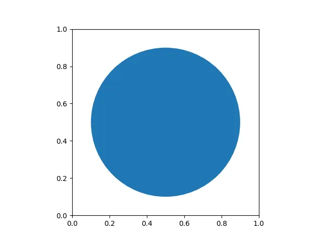
Next, we need to define the circle. We’ll use the Circle class from matplotlib.patches. This class requires two parameters: the center of the circle as a tuple (x, y), and the radius of the circle.
from matplotlib.patches import Circle

center = (0.5, 0.5)
radius = 0.4
circle = Circle(center, radius)
Step 3: Create the Figure and Axes
Now, we need to create a figure and axes using plt.subplots(). The figure is the whole window in the user interface. On the other hand, the axes are the area your plot appears in.
fig, ax = plt.subplots()
Step 4: Add the Circle to the Axes
We can add the circle to the axes using the add_patch() method. This method allows us to add shapes like our circle to the plot.
ax.add_patch(circle)
Step 5: Set the Aspect of the Axes
To ensure the circle isn’t distorted, we need to set the aspect of the axes to be equal. This can be done using the set_aspect() method.
ax.set_aspect('equal')
Step 6: Display the Plot
Finally, we can display the plot using plt.show().
plt.show()
Conclusion
Drawing a circle with matplotlib.pyplot is a straightforward process. By following these steps, you can easily add circles to your plots, which can be useful for highlighting specific areas of interest in your data.
Remember, Matplotlib is a powerful tool for data visualization. It’s not limited to just circles - you can create a wide variety of plots and figures. So, don’t hesitate to explore its other functionalities.
