Plotly
Plotly is a popular open source interactive data visualization tools that allow you create visualizations or charts to understand your data. Plotly has over 40 different types of charts for statistics, geographics, science, finance, regression etc
Built on top of the Plotly JavaScript library (plotly.js), Plotly enables Python users to create beautiful interactive web-based visualizations that can be displayed in Jupyter notebooks, saved to standalone HTML files, or served as part of pure Python-built web applications using Dash. The plotly Python library is sometimes referred to as “plotly.py” to differentiate it from the JavaScript library. Source: Plotly
Plotly VS Matplotlib
Plotly and matplotlib are both popular and the most used Python libraries for data visualization. On one hand, matplotlib is mostly used to create static, and with the help of add on you can create interactive and animated visualisation for professional publication or presentation.
On the other hand, Plotly is a great Python library for creating interactive and animated visualization for geography, science, statistics and finance data which can be used for professional presentation, shared, and easily embedded in web pages.
Additionally, in functionality, matplotlib is more flexible but requires adequate knowledge to use effectively, while plotly has a wide range of prebuilt visualisation that are user friendly.
There are 3 basic components of Plotly:
Install Plotly:
We can use either Conda or PyPI to install Plotly
PyPI
$ pip install plotly==5.11.0
Conda:
$ conda install -c plotly plotly=5.11.0
Build a simple chart with Plotly
Requirements:
JupyterHub notebook or use deepnote
Python
Dataset: Click here to download the Kaggle dataset
import pandas as pd
import plotly.express as px
# read data with pandas
df = pd.read_csv("data1.csv")
# get top 50 rows
df = df[0:50]
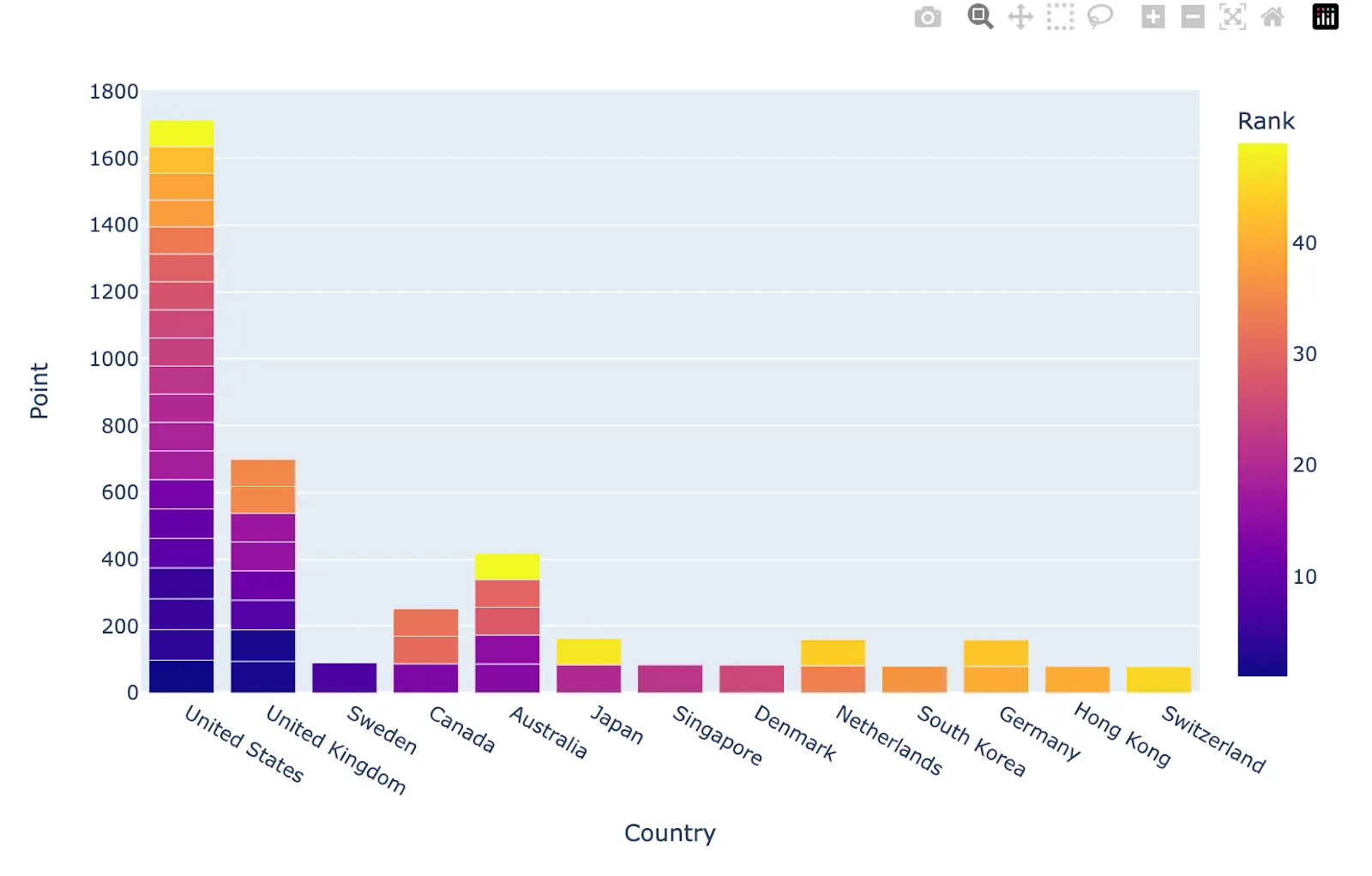
# use plotly express to visualize countires with their school ranks and points
import plotly.express as px
fig = px.bar(x="Country",y="Point",data_frame=df,color="Rank")
fig.show()
The output of this code will produce a chart
Additional resources: