
This article was published when data science tooling like Dask and R was a primary focus for Saturn Cloud. Today, Saturn Cloud is the enterprise AI platform for any GPU infrastructure.
Rotate Tick Labels in Subplot Using Pyplot, Matplotlib, and Gridspec
Introduction
Matplotlib is a powerful Python library for creating static, animated, and interactive visualizations. Pyplot is a Matplotlib module which provides a MATLAB-like interface, and Gridspec is a module for specifying the location of subplots in a figure.
When dealing with subplots, one common issue is the overlapping of axis labels and tick labels. This can make your plots hard to read and interpret. One solution is to rotate the tick labels.
Setting Up Your Environment
Before we start, make sure you have the necessary libraries installed. If not, you can install them using pip:
pip install matplotlib
Creating a Subplot with Matplotlib, Pyplot and GridSpec
First, let’s create a simple subplot using Matplotlib and Pyplot.
import matplotlib.pyplot as plt
from matplotlib.gridspec import GridSpec

# Create a 2x2 grid for subplots
gs = GridSpec(2, 2)
fig = plt.figure(figsize=(10, 6))

# Create some sample data
data = ['Long Category 1', 'Long Category 2', 'Long Category 3', 'Long Category 4']
values = [12, 23, 9, 17]

# Create the first subplot
ax1 = fig.add_subplot(gs[0, 0])
ax1.bar(data, values)
ax1.set_title('Before Rotating')
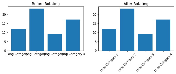
This will create a figure with two subplots. However, you might notice that the x-axis tick labels on the left subplot are overlapping with each other.
Rotating Tick Labels with Matplotlib
# Create the second subplot
ax2 = fig.add_subplot(gs[0, 1])
ax2.bar(data, values)
# Rotate the tick labels in the second subplot
ax2.set_xticklabels(data, rotation=45)
ax2.set_title('After Rotating')

# Show the plots
plt.show()
To solve this issue, we can rotate the x-axis tick labels. This can be done using the xticks() or set_xticklabels() functions in Matplotlib.
Now, the x-axis tick labels are rotated by 45 degrees, and there is no more overlapping.
Full code:
import matplotlib.pyplot as plt
from matplotlib.gridspec import GridSpec

# Create a 2x2 grid for subplots
gs = GridSpec(2, 2)
fig = plt.figure(figsize=(10, 6))

# Create some sample data
data = ['Long Category 1', 'Long Category 2', 'Long Category 3', 'Long Category 4']
values = [12, 23, 9, 17]

# Create the first subplot
ax1 = fig.add_subplot(gs[0, 0])
ax1.bar(data, values)
ax1.set_title('Before Rotating')

# Create the second subplot
ax2 = fig.add_subplot(gs[0, 1])
ax2.bar(data, values)
# Rotate the tick labels in the second subplot
ax2.set_xticklabels(data, rotation=45)
ax2.set_title('After Rotating')

# Show the plots
plt.show()
Conclusion
In this blog post, we’ve seen how to rotate tick labels in a subplot using Pyplot, Matplotlib, and Gridspec. This is a simple but effective way to make your plots more readable and professional-looking.
