
This article was published when data science tooling like Dask and R was a primary focus for Saturn Cloud. Today, Saturn Cloud is the enterprise AI platform for any GPU infrastructure.
Data visualization is a crucial aspect of data science, and Matplotlib is one of the most widely used libraries for this purpose. In this blog post, we will delve into how to plot lines with colors through a colormap in Matplotlib. This technique can be particularly useful when you want to visualize different categories or ranges of data with distinct colors.
Table of Contents
What is Matplotlib?
Matplotlib is a plotting library for the Python programming language. It provides an object-oriented API for embedding plots into applications using general-purpose GUI toolkits like Tkinter, wxPython, Qt, or GTK. Matplotlib is also a popular choice for creating static, animated, and interactive visualizations in Python.
What is a Colormap?
A colormap is a sequence or a gradient of colors used in data visualizations to indicate the magnitude of data points. Matplotlib provides a large number of colormaps, and it’s also possible to create your own if you want to.
How to Plot Lines with Colors Through Colormap in Matplotlib
Let’s dive into the process of plotting lines with colors through a colormap in Matplotlib.
Step 1: Import Necessary Libraries
First, we need to import the necessary libraries. We will need Matplotlib and NumPy for this task.
import matplotlib.pyplot as plt
import numpy as np
Step 2: Create Data
Next, we create some data to plot. For this example, let’s create a simple sine wave.
x = np.linspace(0, 10, 100)
y = np.sin(x)
Step 3: Create a Colormap
Now, we create a colormap. For this example, we will use the ‘viridis’ colormap, but you can choose any other available in Matplotlib.
cmap = plt.get_cmap('viridis')
Step 4: Normalize Your Data
Before we can map our y-values to the colormap, we need to normalize them to the range [0,1]. Matplotlib provides a handy Normalize function for this.
norm = plt.Normalize(y.min(), y.max())
Step 5: Map Y-values to Colormap
Now we can map our y-values to the colormap.
line_colors = cmap(norm(y))
Step 6: Plot the Line with Colors
Finally, we can plot our line with colors. We use the scatter function instead of plot to be able to specify a different color for each point.
plt.scatter(x, y, color=line_colors)
plt.show()
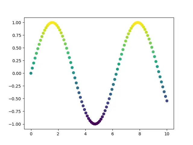
And there you have it! A beautiful line plot colored through a colormap.
Conclusion
Matplotlib is a powerful tool for data visualization in Python. The ability to plot lines with colors through a colormap allows for more nuanced and detailed visualizations. This technique can be particularly useful when you want to visualize different categories or ranges of data with distinct colors.
Whether you’re a seasoned data scientist or just starting out, mastering Matplotlib and its various features will undoubtedly enhance your data visualization skills.

