
This article was published when data science tooling like Dask and R was a primary focus for Saturn Cloud. Today, Saturn Cloud is the enterprise AI platform for any GPU infrastructure.
As a data scientist or software engineer, you are probably familiar with the importance of visualizing data. It is often said that a picture is worth a thousand words, and this is especially true when it comes to data analysis. One of the most popular tools for data visualization in Python is Matplotlib, a powerful library that allows you to create a wide range of charts and graphs. In this article, we will focus on using Matplotlib to plot multiple columns of a Pandas data frame on a bar chart.
Table of Contents
- What Is Matplotlib?
- What Is a Pandas Data Frame?
- How to Plot Multiple Columns of a Pandas Data Frame on a Bar Chart Using Matplotlib
- Common Errors and Solutions
- Conclusion
What Is Matplotlib?
Matplotlib is a plotting library for the Python programming language and its numerical mathematics extension NumPy. It provides an object-oriented API for embedding plots into applications using general-purpose GUI toolkits like Tkinter, wxPython, Qt, or GTK. Matplotlib is also a popular library for creating static, interactive, and animated visualizations in Python.
What Is a Pandas Data Frame?
Pandas is a fast, powerful, flexible, and easy-to-use open-source data analysis and manipulation tool built on top of the Python programming language. It provides data structures for efficiently storing and manipulating large datasets and tools for data cleaning, merging, and reshaping. The Pandas data frame is a two-dimensional table-like data structure with labeled axes (rows and columns) that can hold multiple data types, including numeric, character, and categorical data.
How to Plot Multiple Columns of a Pandas Data Frame on a Bar Chart Using Matplotlib
To plot multiple columns of a Pandas data frame on a bar chart using Matplotlib, we need to follow a few steps:
Step 1: Import the Required Libraries
We need to import the required libraries for data manipulation and visualization. In this case, we need Pandas and Matplotlib:
import pandas as pd
import matplotlib.pyplot as plt
Step 2: Create a Pandas Data Frame
We need to create a Pandas data frame that contains the data we want to plot. For this example, let’s create a data frame that contains the sales data for a company over the past five years. The data frame has two columns: Year and Sales.
sales_data = {'Year': [2016, 2017, 2018, 2019, 2020],
              'Sales_A': [1000, 1500, 2000, 2500, 3000],
              'Sales_B': [1200, 1700, 2200, 2700, 3200],
              'Sales_C': [1400, 1900, 2400, 2900, 3400]}

df = pd.DataFrame(sales_data)
Step 3: Create a Bar Chart
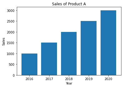
We can create a simple bar chart using the Matplotlib library. We need to specify the x-axis and y-axis data and then add labels and a title to the chart.
plt.bar(df['Year'], df['Sales_A'])
plt.xlabel('Year')
plt.ylabel('Sales')
plt.title('Sales of Product A')
plt.show()
This will create a bar chart that shows the sales of Product A over the past five years.
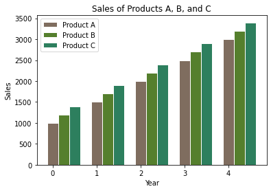
Step 4: Add Multiple Columns to the Bar Chart
To add multiple columns to the bar chart, we need to create multiple bar plots on the same axis. We can do this by using the plt.bar() function multiple times, once for each column we want to include. We can also adjust the width of the bars and the position of the bars to make the chart more readable.
# Set the width of the bars
barWidth = 0.25

# Set the position of the bars on the x-axis
r1 = np.arange(len(df['Year']))
r2 = [x + barWidth for x in r1]
r3 = [x + barWidth for x in r2]

# Create the bar plots
plt.bar(r1, df['Sales_A'], color='#7f6d5f', width=barWidth, edgecolor='white', label='Product A')
plt.bar(r2, df['Sales_B'], color='#557f2d', width=barWidth, edgecolor='white', label='Product B')
plt.bar(r3, df['Sales_C'], color='#2d7f5e', width=barWidth, edgecolor='white', label='Product C')

# Add x-axis and y-axis labels and a title
plt.xlabel('Year')
plt.ylabel('Sales')
plt.title('Sales of Products A, B, and C')

# Add legend
plt.legend()

# Show the chart
plt.show()
This will create a bar chart that shows the sales of Products A, B, and C over the past five years.
Common Errors and Solutions
Error 1: “ValueError: shape mismatch”
This error occurs when the length of the x-axis (df.index) and the y-axis data are not the same. Ensure they have the same length by checking your data or using the plt.bar() method.
Solution: Ensure df.index and df[column] have the same length.
# Example:
df = df.dropna()  # Remove NaN values
Error 2: “TypeError: unhashable type: ‘slice’”
This error may occur if the columns_to_plot list contains non-hashable elements. Convert them to hashable types like strings.
Solution: Convert non-hashable elements to strings.
# Example:
columns_to_plot = [str(col) for col in columns_to_plot]
Error 3: “TypeError: float() argument must be a string or a number, not ‘method’”
This error may occur if the data in the specified columns contain non-numeric values. Ensure the data types are appropriate for plotting.
Solution: Convert data to numeric type
# Example:
df['column1'] = pd.to_numeric(df['column1'], errors='coerce')
Conclusion
Matplotlib is a powerful library for data visualization in Python, and Pandas is a popular library for data manipulation. By combining these two libraries, we can create powerful visualizations of our data. In this article, we have shown how to use Matplotlib to plot multiple columns of a Pandas data frame on a bar chart. By following these steps, you can create beautiful and informative visualizations of your data.

