
This article was published when data science tooling like Dask and R was a primary focus for Saturn Cloud. Today, Saturn Cloud is the enterprise AI platform for any GPU infrastructure.
As a data scientist or software engineer, you may often find yourself working with Pandas DataFrames and creating visualizations to analyze your data. One common issue that you may encounter is how to set x-axis intervals (ticks) for your graph of a Pandas DataFrame. In this article, we will explore various methods to achieve this.
As a data scientist or software engineer, you may often find yourself working with Pandas DataFrames and creating visualizations to analyze your data. One common issue that you may encounter is how to set x-axis intervals (ticks) for your graph of a Pandas DataFrame. In this article, we will explore various methods to achieve this.
Table of Contents
What are x-axis intervals (ticks)?
Before we dive into the details, let’s first define what x-axis intervals (ticks) are. In a graph, the x-axis represents the horizontal axis, and the y-axis represents the vertical axis. The x-axis is typically used to represent the independent variable, while the y-axis represents the dependent variable. X-axis intervals (ticks) are the markings on the x-axis that help the reader interpret the data more easily.
What is a Pandas DataFrame?
Pandas is a popular open-source data analysis and manipulation library for Python. It provides various data structures, such as DataFrame and Series, to handle and analyze data efficiently. A DataFrame is a two-dimensional labeled data structure with columns of potentially different types. It is similar to a spreadsheet or a SQL table. You can think of it as a container for tabular data.
Setting x-axis intervals (ticks) for a graph of Pandas DataFrame
Now that we have a basic understanding of what x-axis intervals (ticks) and Pandas DataFrames are, let’s dive into how to set x-axis intervals (ticks) for a graph of a Pandas DataFrame. We will use the following sample DataFrame for our examples:
import pandas as pd
import matplotlib.pyplot as plt
df = pd.DataFrame({
'year': [2010, 2011, 2012, 2013, 2014, 2015, 2016, 2017, 2018, 2019, 2020],
'sales': [5, 8, 12, 15, 20, 25, 30, 35, 40, 45, 50]
})
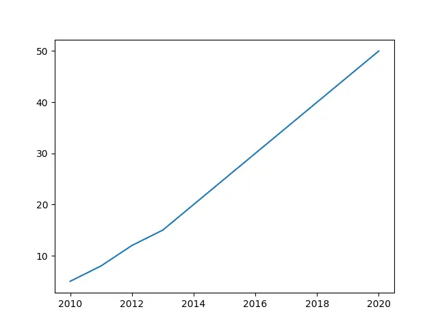
plt.plot(df['year'], df['sales'])
plt.show()
This will create a simple line plot of the “sales” column against the “year” column.
Method 1: Using matplotlib
One way to set x-axis intervals (ticks) is to use the xticks() function from the matplotlib library. This function takes two arguments: the first argument specifies the locations of the ticks, and the second argument specifies the labels for the ticks.
import pandas as pd
import matplotlib.pyplot as plt
df = pd.DataFrame({
'year': [2010, 2011, 2012, 2013, 2014, 2015, 2016, 2017, 2018, 2019, 2020],
'sales': [5, 8, 12, 15, 20, 25, 30, 35, 40, 45, 50]
})
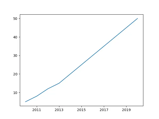
plt.plot(df['year'], df['sales'])
plt.xticks([2011, 2013, 2015, 2017, 2019])
plt.show()
This will set the x-axis ticks to appear at the specified locations (2011, 2013, 2015, 2017, 2019).
Method 2: Using pandas.plot()
Another way to set x-axis intervals (ticks) is to use the pandas.plot() function. This function is a convenient wrapper around matplotlib and allows you to create basic plots quickly. You can pass arguments to pandas.plot() to set the x-axis ticks.
import pandas as pd
df = pd.DataFrame({
'year': [2010, 2011, 2012, 2013, 2014, 2015, 2016, 2017, 2018, 2019, 2020],
'sales': [5, 8, 12, 15, 20, 25, 30, 35, 40, 45, 50]
})
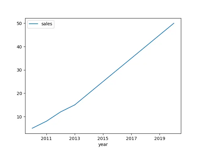
df.plot(x='year', y='sales', xticks=[2011, 2013, 2015, 2017, 2019])
This will create the same plot as method 1, but using the pandas.plot() function instead.

Method 3: Using pandas.DataFrame.plot()
If you prefer to use the object-oriented approach, you can also use the plot() function directly on the DataFrame. This allows you to customize the plot further.
import pandas as pd
import matplotlib.pyplot as plt

df = pd.DataFrame({
    'year': [2010, 2011, 2012, 2013, 2014, 2015, 2016, 2017, 2018, 2019, 2020],
    'sales': [5, 8, 12, 15, 20, 25, 30, 35, 40, 45, 50]
})

ax = df.plot(x='year', y='sales')
ax.set_xticks([2011, 2013, 2015, 2017, 2019])
plt.show()
This will create the same plot as method 1 and 2, but using the object-oriented approach.
Conclusion
In conclusion, setting x-axis intervals (ticks) for a graph of a Pandas DataFrame is a simple task that can be achieved using various methods. You can use matplotlib to set the ticks manually, or you can use the pandas.plot() function to set the ticks directly. You can also use the object-oriented approach by using the plot() function directly on the DataFrame. By using these methods, you can create more informative and visually appealing graphs for data analysis.
