
This article was published when data science tooling like Dask and R was a primary focus for Saturn Cloud. Today, Saturn Cloud is the enterprise AI platform for any GPU infrastructure.
Introduction
Seaborn is a Python data visualization library based on Matplotlib. It provides a high-level interface for drawing attractive and informative statistical graphics. Matplotlib, on the other hand, is a comprehensive library for creating static, animated, and interactive visualizations in Python.
Sometimes, for aesthetic or clarity purposes, you might want to remove or hide the x-axis labels from your plots. This post will guide you through the process step by step.
Prerequisites
Before we start, ensure you have the following Python libraries installed:
- Seaborn
- Matplotlib
- Pandas
You can install them using pip:
pip install seaborn matplotlib pandas
Removing X-Axis Labels in Seaborn/Matplotlib
Let’s start by creating a simple Seaborn plot. We’ll use the tips dataset available in the Seaborn library.
import seaborn as sns
import matplotlib.pyplot as plt

# Load the dataset
tips = sns.load_dataset("tips")

# Create a bar plot
sns.barplot(x="day", y="total_bill", data=tips)
plt.show()
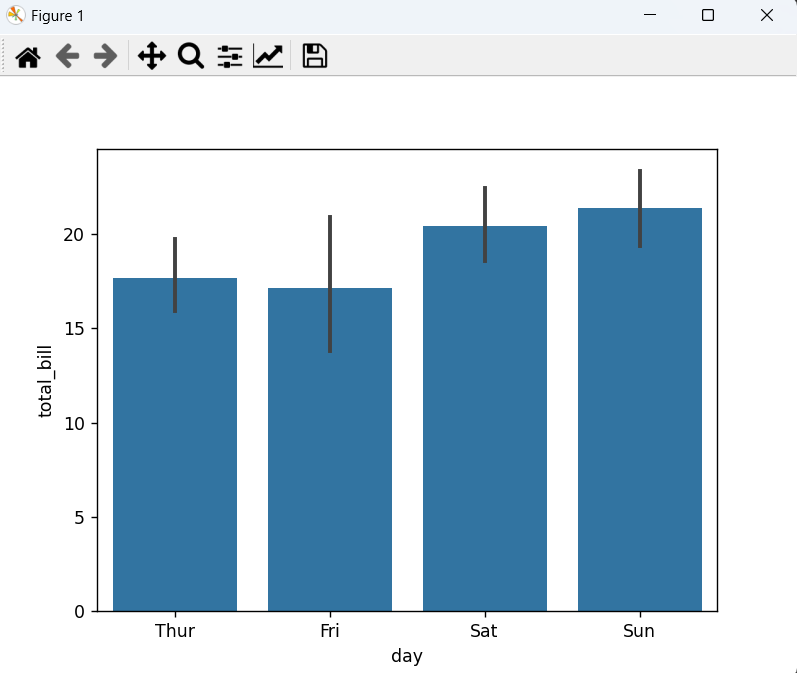
This will create a bar plot showing the total bill for each day. The x-axis labels here are ‘Thur’, ‘Fri’, ‘Sat’, and ‘Sun’.
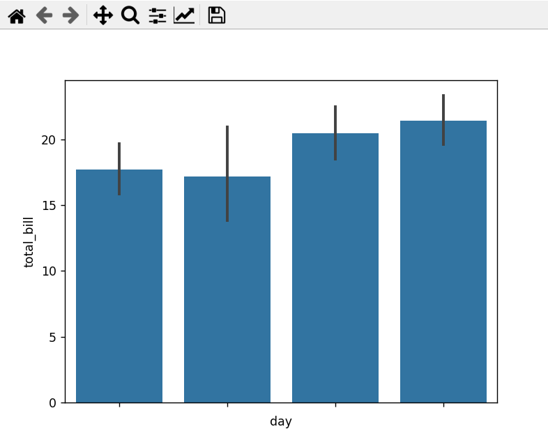
To remove these labels, we can use the set_xticklabels() function from Matplotlib, passing an empty list as the argument.
sns.barplot(x="day", y="total_bill", data=tips)
plt.gca().set_xticklabels([])
plt.show()
Now, the x-axis labels are removed from the plot as shown below:
Hiding X-Axis Labels in Seaborn/Matplotlib
In some cases, you might want to hide the x-axis labels instead of removing them. This can be achieved using the xticks() function from Matplotlib with the visible parameter set to False.
sns.barplot(x="day", y="total_bill", data=tips)
plt.xticks(visible=False)
plt.show()
This will hide the x-axis labels from the plot.
Conclusion
Removing or hiding x-axis labels in Seaborn/Matplotlib is a straightforward process. Whether you want to improve the aesthetics of your plot or avoid unnecessary clutter, these techniques will come in handy.
Remember, effective data visualization is not just about presenting data but also about making it easy for your audience to understand the story the data is telling.
