
This article was published when data science tooling like Dask and R was a primary focus for Saturn Cloud. Today, Saturn Cloud is the enterprise AI platform for any GPU infrastructure.
As a data scientist or software engineer, you may often find yourself working with data that contains multiple variables or time series. You may want to visualize the relationship between these variables or track the changes over time. One effective way to achieve this is by plotting multiple lines on a single graph. In this article, we will explore how to plot multiple lines with pandas dataframe.
Prerequisites
Before we begin, make sure you have the following prerequisites installed:
- Pandas
- Matplotlib
If you are using Anaconda, you can install these packages by running the following command in your terminal:
conda install pandas matplotlib
Dataset
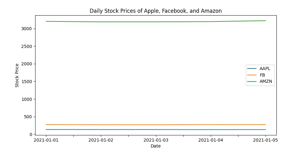
For this tutorial, we will be using a sample dataset that contains the daily stock prices of three technology companies - Apple, Facebook, and Amazon. The dataset has the following columns:
- Date: The date of the stock price
- AAPL: The stock price of Apple
- FB: The stock price of Facebook
- AMZN: The stock price of Amazon
Here is a sample of the dataset:
| Date | AAPL | FB | AMZN |
|---|---|---|---|
| 2021-01-01 | 132.69 | 273.16 | 3,204.4 |
| 2021-01-02 | 131.51 | 268.94 | 3,190.0 |
| 2021-01-03 | 131.51 | 268.94 | 3,190.0 |
| 2021-01-04 | 129.41 | 270.97 | 3,197.2 |
| 2021-01-05 | 131.01 | 272.87 | 3,222.9 |
Importing the Data
First, we need to import the data into a pandas dataframe. Assuming that the data is stored in a CSV file named tech_stocks.csv, we can use the read_csv() function from pandas to load the data.
import pandas as pd

# Load the data into a pandas dataframe
df = pd.read_csv('tech_stocks.csv')

# Display the first five rows of the dataframe
print(df.head())
Plotting Multiple Lines
Now that we have loaded the data into a pandas dataframe, we can plot multiple lines using the plot() function from pandas. The plot() function allows us to specify the x-axis, y-axis, and the type of plot (line, bar, scatter, etc.).
To plot multiple lines, we need to specify the x-axis (in this case, the Date column) and the y-axis (in this case, the AAPL, FB, and AMZN columns) as a list of column names.
import matplotlib.pyplot as plt

# Plot the stock prices of Apple, Facebook, and Amazon
df.plot(x='Date', y=['AAPL', 'FB', 'AMZN'], figsize=(10,5))

# Set the x-axis label
plt.xlabel('Date')

# Set the y-axis label
plt.ylabel('Stock Price')

# Set the title of the plot
plt.title('Daily Stock Prices of Apple, Facebook, and Amazon')

# Display the plot
plt.show()
The figsize parameter in the plot() function specifies the size of the plot. In this case, we have set the size to 10 inches by 5 inches.
The xlabel(), ylabel(), and title() functions allow us to set the x-axis label, y-axis label, and the title of the plot, respectively.
Pros and Cons of Plotting Multiple Lines with Pandas DataFrame:
Pros
Clear Data Representation: Plotting multiple lines on a single graph provides a visually intuitive way to represent the relationship between different variables or time series data. It allows for easy identification of patterns and trends.
Comparative Analysis: The ability to visualize multiple lines on the same plot facilitates direct comparison between the variables. This is particularly useful when analyzing trends or changes over time for different categories.
Concise Visualization: Instead of creating separate plots for each variable, combining them into a single graph simplifies the overall visualization. This can lead to clearer and more concise communication of insights.
Interactive Exploration: With the interactive features of modern plotting libraries like Matplotlib, viewers can zoom in, pan, and interact with the plot, enhancing the exploration of the data and specific points of interest.
Cons
Cluttered Visualization: Depending on the number of lines and the complexity of the data, plotting multiple lines on a single graph can lead to visual clutter. Overlapping lines may make it challenging to discern individual trends.
Color Differentiation: Assigning different colors to each line is a common practice, but it can be challenging for individuals with color vision deficiencies. This may result in difficulties distinguishing between the lines.
Limited Scalability: As the number of lines increases, the scalability of this approach diminishes. Beyond a certain point, it may be more practical to consider alternative visualization methods, such as small multiples or faceted plots.
Error Handling in Plotting Multiple Lines:
Missing Data: If the dataset contains missing or null values, it may result in gaps in the plotted lines. Addressing missing data through imputation or cleaning is essential for accurate and meaningful visualization.
Inconsistent Data Types: Ensure that the data types of the columns used for plotting are consistent. Mismatched data types may lead to unexpected errors or inaccuracies in the visualization.
Incorrect Axis Labels: Double-check that the specified x-axis and y-axis labels accurately reflect the data being plotted. Incorrect axis labels can lead to confusion and misinterpretation of the plot.
Data Integrity: Verify the integrity of the dataset, especially when dealing with time series data. Inconsistent or erroneous data points can distort the visual representation of trends.
Conclusion
In this article, we have explored how to plot multiple lines with pandas dataframe. We have used a sample dataset that contains the daily stock prices of three technology companies - Apple, Facebook, and Amazon - to demonstrate how to plot multiple lines on a single graph.
By following the steps outlined in this tutorial, you can easily plot multiple lines with pandas dataframe and gain valuable insights from your data.

