
This article was published when data science tooling like Dask and R was a primary focus for Saturn Cloud. Today, Saturn Cloud is the enterprise AI platform for any GPU infrastructure.
Data visualization is an essential part of any data analysis project. It helps to explore and understand trends, patterns, and relationships within the data. In this tutorial, we will learn how to plot multiple graphs in a for loop using iPython/Jupyter Notebook and Pandas. This will help us to create visualizations for large datasets without repeating the same code multiple times.
Table of Contents
- What is iPython/Jupyter Notebook?
- What is Pandas?
- Plotting Multiple Graphs in a For Loop
- Best Practices
- Conclusion
What is iPython/Jupyter Notebook?
iPython/Jupyter Notebook is an open-source web-based interactive computational environment that enables users to create and share documents containing live code, equations, visualizations, and narrative text. It allows data scientists and software engineers to create and share code, visualizations, and data analyses with others. iPython/Jupyter Notebook supports many programming languages, including Python, R, and Julia.
What is Pandas?
Pandas is a powerful Python library for data manipulation and analysis. It provides data structures for efficient storage and manipulation of large datasets, as well as tools for working with missing data, time series, and statistical analysis. Pandas is widely used in data science and machine learning projects.
Plotting Multiple Graphs in a For Loop
When working with large datasets, we often need to create multiple graphs for different subsets of the data. Manually creating each graph can be time-consuming and repetitive. Instead, we can use a for loop to automate the process and plot multiple graphs with different subsets of the data.
To plot multiple graphs in a for loop, we can use the following steps:
Step 1: Import Required Libraries
First, we need to import the required libraries, including Pandas and Matplotlib.
import pandas as pd
import matplotlib.pyplot as plt
Step 2: Load the Data
Next, we need to load the data into a Pandas DataFrame.
data = pd.read_csv('data.csv')
Step 3: Define the Subset of Data
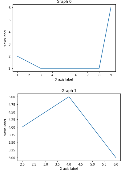
We can define the subset of data for each graph using a for loop. In this example, we will create four graphs, each showing a different subset of the data.
for i in range(2):
    subset = data[data['column'] == i]
    plt.plot(subset['x'], subset['y'])
    plt.title(f'Graph {i}')
    plt.xlabel('X-axis label')
    plt.ylabel('Y-axis label')
    plt.show()
In this example, we are looping through four different subsets of the data, defined by the value in the ‘column’ column of the DataFrame. For each subset, we plot the ‘x’ and ‘y’ columns and add a title, x-axis label, and y-axis label to the graph. Finally, we show the graph using the plt.show() function.
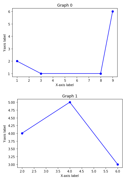
Step 4: Customize the Graphs
We can customize the graphs further by adding additional code within the for loop. For example, we can change the color, linestyle, and marker of the lines in the graph.
for i in range(2):
    subset = data[data['column'] == i]
    plt.plot(subset['x'], subset['y'], color='blue', linestyle='-', marker='o')
    plt.title(f'Graph {i}')
    plt.xlabel('X-axis label')
    plt.ylabel('Y-axis label')
    plt.show()
In this example, we have changed the color of the line to blue, the linestyle to a solid line, and the marker to a circle.
Best Practices:
Practice 1: Data Preprocessing
Before plotting, it’s essential to preprocess the data. Handle missing values, convert data types, and ensure columns are in the right format.
Practice 2: Function for Plotting
Encapsulate the plotting logic in a function. This makes the code more modular and reusable, promoting cleaner and more maintainable notebooks.
def plot_graph(subset, title, xlabel, ylabel, color='blue', linestyle='-', marker='o'):
    plt.plot(subset['x'], subset['y'], color=color, linestyle=linestyle, marker=marker)
    plt.title(title)
    plt.xlabel(xlabel)
    plt.ylabel(ylabel)
    plt.show()

# Usage:
for i in range(4):
    subset = data[data['column'] == i]
    plot_graph(subset, f'Graph {i}', 'X-axis label', 'Y-axis label')
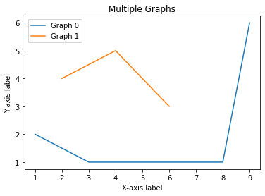
Practice 3: Use Seaborn for Stylish Plots
Consider using Seaborn, a statistical data visualization library based on Matplotlib. It simplifies the code for creating attractive and informative statistical graphics.
import seaborn as sns

for i in range(4):
    subset = data[data['column'] == i]
    sns.lineplot(x='x', y='y', data=subset, label=f'Graph {i}')

plt.title('Multiple Graphs')
plt.xlabel('X-axis label')
plt.ylabel('Y-axis label')
plt.legend()
plt.show()
Conclusion
In this tutorial, we have learned how to plot multiple graphs in a for loop using iPython/Jupyter Notebook and Pandas. This technique can save time and reduce redundancy when creating visualizations for large datasets. By customizing the code within the for loop, we can create unique and informative graphs for different subsets of the data. With these tools, data scientists and software engineers can create effective and dynamic visualizations to analyze and communicate their findings.
