
This article was published when data science tooling like Dask and R was a primary focus for Saturn Cloud. Today, Saturn Cloud is the enterprise AI platform for any GPU infrastructure.
As a data scientist or software engineer, it is important to be able to visualize data in an easily understandable way. One popular tool for this is Seaborn, a Python data visualization library built on top of Matplotlib. In this article, we will explore how to plot multiple columns of a Pandas DataFrame using Seaborn.
Table of Contents
- What is Seaborn?
- What is a Pandas DataFrame?
- How to Plot Multiple Columns of Pandas DataFrame using Seaborn
- Common Errors and Solutions
- Best Practices
- Conclusion
What is Seaborn?
Seaborn is a Python data visualization library that provides a high-level interface for creating informative and attractive statistical graphics. It is built on top of Matplotlib and tightly integrated with the PyData stack, including NumPy and Pandas.
Seaborn provides a number of unique features, such as color palettes, faceting, and built-in statistical functions, that make it an ideal tool for exploring and understanding data.
What is a Pandas DataFrame?
Pandas is a Python library that provides data manipulation and analysis tools. It is built on top of NumPy, another popular Python library for scientific computing.
A Pandas DataFrame is a two-dimensional table of data with columns and rows. Each column can contain a different data type, such as numbers, strings, or dates, and the rows can be indexed by a unique identifier.
How to Plot Multiple Columns of Pandas DataFrame using Seaborn
To plot multiple columns of a Pandas DataFrame using Seaborn, we can use the sns.lineplot() function. This function creates a line plot of one or more variables over time.
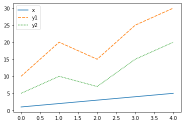
Here is an example of how to plot two columns of a Pandas DataFrame using Seaborn:
import seaborn as sns
import pandas as pd

# create a Pandas DataFrame
df = pd.DataFrame({'x': [1, 2, 3, 4, 5], 'y1': [10, 20, 15, 25, 30], 'y2': [5, 10, 7, 15, 20]})

# plot two columns using Seaborn
sns.lineplot(data=df[['x', 'y1', 'y2']])
In this example, we create a Pandas DataFrame with three columns: x, y1, and y2. We then pass the x, y1, and y2 columns to the sns.lineplot() function to create a line plot of the data.
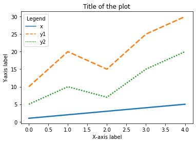
We can also customize the plot by adding labels, changing the colors, and modifying the legend. Here is an example of how to do this:
import seaborn as sns
import pandas as pd
import matplotlib.pyplot as plt

# create a Pandas DataFrame
df = pd.DataFrame({'x': [1, 2, 3, 4, 5], 'y1': [10, 20, 15, 25, 30], 'y2': [5, 10, 7, 15, 20]})

# plot two columns using Seaborn with labels and legend
sns.lineplot(data=df[['x', 'y1', 'y2']], linewidth=2.5, palette="tab10")
plt.xlabel('X-axis label')
plt.ylabel('Y-axis label')
plt.title('Title of the plot')
plt.legend(title='Legend', loc='upper left')
In this example, we add labels to the x and y axes, a title to the plot, and a legend with a title. We also change the line width and use a color palette to distinguish between the two columns.
Common Errors and Solutions
1. Error: "ValueError: 'data' must be of DataFrame type."
- Cause: This error occurs when the ‘data’ parameter passed to
sns.lineplot()is not a DataFrame. - Solution: Ensure that the input to the function is a Pandas DataFrame.
# Incorrect
sns.lineplot(x='x', y='y1', data=df)

# Correct
sns.lineplot(data=df[['x', 'y1']])
2. Error: "KeyError: 'Column not found.'"
- Cause: This error happens when the specified column(s) in the DataFrame do not exist.
- Solution: Check for typos or verify that the specified columns are present in the DataFrame.
# Incorrect
sns.lineplot(data=df[['x', 'y3']])

# Correct
sns.lineplot(data=df[['x', 'y1']])
3. Error: "TypeError: palette is not a valid argument."
- Cause: The ‘palette’ argument is not recognized, or its value is not appropriate.
- Solution: Ensure that the ‘palette’ argument receives a valid value.
# Incorrect
sns.lineplot(data=df[['x', 'y1', 'y2']], palette="rainbow")

# Correct
sns.lineplot(data=df[['x', 'y1', 'y2']], palette="tab10")
Best Practices
1. Data Integrity:
- Ensure your DataFrame is clean and contains the expected columns. Perform data validation before plotting.
2. Consistent Data Types:
- Make sure the data types of the columns you want to plot are appropriate for the chosen visualization. For example, ensure numerical columns are of numeric types.
3. Handling Missing Data:
- Address any missing values in your DataFrame before plotting. Use methods like
dropna()or imputation based on your analysis requirements.
4. Clear Labels and Titles:
- Always add clear and concise labels to your axes. Include a title that provides context to the plot.
5. Legend Placement:
- Choose a suitable location for the legend to avoid overlapping with the plot. Experiment with positions using the
locparameter.
6. Color Palettes:
- Select color palettes carefully. Ensure that colors are easily distinguishable, especially when plotting multiple lines.
7. Code Modularity:
- Break down your plotting code into modular functions, making it easier to reuse and maintain.
8. Exploratory Visualization:
- Use Seaborn’s additional features for exploratory data analysis, such as faceting and statistical functions, to gain more insights.
Conclusion
In this article, we have explored how to plot multiple columns of a Pandas DataFrame using Seaborn. Seaborn provides a number of useful features for creating informative and attractive visualizations, and the sns.lineplot() function is a simple and effective way to plot multiple columns of data.
By following the examples in this article, you should be able to create your own customized line plots of multiple columns of data in no time.
