
This article was published when data science tooling like Dask and R was a primary focus for Saturn Cloud. Today, Saturn Cloud is the enterprise AI platform for any GPU infrastructure.
If you are a data scientist or software engineer who is working with multiple linear regression models, you may need to visualize the relationship between the independent variables and the dependent variable. This can help you understand how the independent variables are related to the dependent variable and how they contribute to the overall prediction. In this blog post, we will explore how to plot for multiple linear regression models using Matplotlib.
Table of Contents
- Introduction
- What is Multiple Linear Regression?
- Plotting for Multiple Linear Regression Model
- Conclusion
What is Multiple Linear Regression?
Multiple linear regression is a statistical technique used to model the relationship between a dependent variable and two or more independent variables. In this technique, we use a linear equation to represent the relationship between the variables. The equation can be written as:
Y = b0 + b1X1 + b2X2 + ... + bnxn
Where:
- Y is the dependent variable
- X1, X2, …, Xn are the independent variables
- b0, b1, b2, …, bn are the coefficients of the independent variables
Multiple linear regression is a powerful tool for predicting the value of the dependent variable based on the values of the independent variables. It is widely used in various fields such as finance, economics, and social sciences.
Plotting for Multiple Linear Regression Model
When working with multiple linear regression, it is essential to visualize the relationship between the independent variables and the dependent variable. This can help you identify any patterns or trends in the data and understand how the independent variables affect the dependent variable.
To plot for multiple linear regression, we will be using Matplotlib, which is a popular data visualization library in Python. Matplotlib provides various functions to create different types of plots, including scatter plots, line plots, and bar plots.
Step 1: Import Required Libraries
Before we start plotting, we need to import the required libraries. In this case, we need Matplotlib, NumPy, and Pandas. We can import the libraries using the following code:
import matplotlib.pyplot as plt
import numpy as np
import pandas as pd
Step 2: Load the Data
Next, we need to load the data into our program. We can use Pandas to read the data from a CSV file. In this example, we will be using the ‘Boston Housing’ dataset, which is a popular dataset in machine learning. The dataset contains information about the housing prices in Boston based on various features such as the number of rooms, crime rate, etc.
data = pd.read_csv('boston_housing.csv')
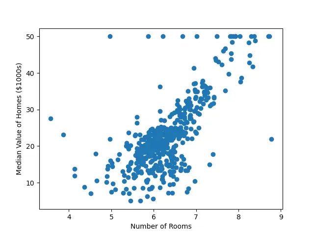
Step 3: Create the Scatter Plot
Once we have loaded the data, we can create a scatter plot using Matplotlib. In this plot, we will be using the ‘RM’ feature, which represents the average number of rooms per dwelling, as the independent variable, and the ‘MEDV’ feature, which represents the median value of owner-occupied homes in $1000s, as the dependent variable.
x = data['RM']
y = data['MEDV']
plt.scatter(x, y)
plt.xlabel('Number of Rooms')
plt.ylabel('Median Value of Homes ($1000s)')
plt.show()
The above code will create a scatter plot with the ‘Number of Rooms’ on the x-axis and ‘Median Value of Homes’ on the y-axis.
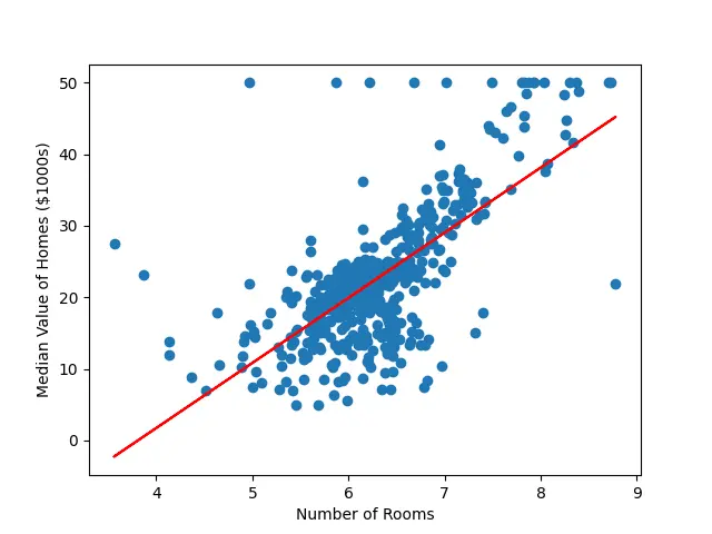
Step 4: Add the Regression Line
To add the regression line to the plot, we need to calculate the coefficients of the independent variables. We can use NumPy to calculate the coefficients. The code to calculate the coefficients is as follows:
# Convert the data into arrays
x = np.array(x)
y = np.array(y)

# Calculate the coefficients
b1, b0 = np.polyfit(x, y, 1)
Once we have calculated the coefficients, we can add the regression line to the plot using the following code:
# Add the regression line
plt.plot(x, b1*x + b0, color='red')
plt.show()
The above code will add the regression line to the scatter plot.
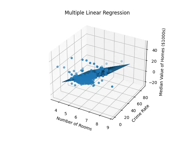
Step 5: Add Multiple Independent Variables
If we have more than one independent variable, we can still use Matplotlib to plot for multiple linear regression. In this case, we need to create a 3D plot using the ‘mplot3d’ toolkit in Matplotlib.
import pandas as pd
import numpy as np
import matplotlib.pyplot as plt
from mpl_toolkits.mplot3d import Axes3D

# Load the data
data = pd.read_csv('boston_housing.csv')

# Create the plot
fig = plt.figure()
ax = fig.add_subplot(111, projection='3d')

# Define the independent variables
x = data['RM']
y = data['CRIM']
z = data['MEDV']

# Add the data points
ax.scatter(x, y, z)

# Fit a plane using np.linalg.lstsq
A = np.vstack([x, y, np.ones_like(x)]).T
plane_coef, _, _, _ = np.linalg.lstsq(A, z, rcond=None)

# Create a meshgrid for the plane
x_plane, y_plane = np.meshgrid(x, y)
z_plane = plane_coef[0] * x_plane + plane_coef[1] * y_plane + plane_coef[2]

# Add the regression plane
ax.plot_surface(x_plane, y_plane, z_plane, alpha=0.5)

# Add labels and title
ax.set_xlabel('Number of Rooms')
ax.set_ylabel('Crime Rate')
ax.set_zlabel('Median Value of Homes ($1000s)')
plt.title('Multiple Linear Regression')

# Show the plot
plt.show()
The above code will create a 3D plot with ‘Number of Rooms’ and ‘Crime Rate’ as the independent variables and ‘Median Value of Homes’ as the dependent variable.
Error Handling
- Data Loading Error Handling: Add error handling when loading the data to check if the file exists and if it is in the expected format.
try:
    data = pd.read_csv('boston_housing.csv')
except FileNotFoundError:
    print("Error: Data file 'boston_housing.csv' not found. Make sure the file exists.")
    exit(1)
except pd.errors.EmptyDataError:
    print("Error: Data file is empty or in an unexpected format.")
    exit(1)
- Data Structure Validation: Validate the structure of the loaded data, ensuring it contains the necessary columns (‘RM’, ‘CRIM’, ‘MEDV’).
required_columns = ['RM', 'CRIM', 'MEDV']
if not all(col in data.columns for col in required_columns):
    print(f"Error: Data is missing required columns. Expected columns: {', '.join(required_columns)}")
    exit(1)
- Regression Coefficients Calculation Error Handling: Add error handling for the regression coefficients calculation using NumPy’s polyfit. Check if the calculation is successful.
try:
    b1, b0 = np.polyfit(x, y, 1)
except np.linalg.LinAlgError:
    print("Error: Unable to calculate regression coefficients.")
    exit(1)
- 3D Plotting Error Handling: For the 3D plotting section, include error handling to check if the required columns are present in the data.
required_columns_3d = ['RM', 'CRIM', 'MEDV']
if not all(col in data.columns for col in required_columns_3d):
    print(f"Error: Data is missing required columns for 3D plotting. Expected columns: {', '.join(required_columns_3d)}")
    exit(1)
Conclusion
Plotting for multiple linear regression models can be a powerful tool for data scientists and software engineers. With Matplotlib, we can easily visualize the relationship between the independent variables and the dependent variable and gain insights into the data. In this blog post, we have explored how to plot for multiple linear regression using Matplotlib. We have covered the steps required to create a scatter plot with a regression line and a 3D plot with multiple independent variables. We hope this blog post has been helpful to you in your work with multiple linear regression models.
