
This article was published when data science tooling like Dask and R was a primary focus for Saturn Cloud. Today, Saturn Cloud is the enterprise AI platform for any GPU infrastructure.
As a data scientist or software engineer, you might be familiar with Matplotlib, a popular data visualization library in Python. Matplotlib has various features that allow you to create charts, histograms, line plots, and scatter plots. However, when it comes to drawing a scatter trend line on Matplotlib, things can get a bit tricky. In this article, we will guide you on how to draw a scatter trend line on Matplotlib using Python Pandas.
What is a Scatter Trend Line?
A scatter plot is a graph that displays values for two different variables that can be plotted on the x and y-axis. When the x-axis and y-axis values are plotted with a trend line, it shows the relationship between the two variables. A trend line is also referred to as a line of best fit, which is a straight line that best represents the data on a scatter plot.
Steps to Draw a Scatter Trend Line on Matplotlib
Suppose that we have the following DataFrame with synthetic weight and height data:
   Weight  Height
0      60     160
1      65     165
2      70     170
3      75     175
4      80     180
5      85     185
6      90     190
Step 1: Import Required Libraries
Before we get started, we need to import the necessary libraries. We will be using Matplotlib, NumPy, and Pandas in this article. To import the libraries, you can use the following code:
# Import libraries
import matplotlib.pyplot as plt
import numpy as np
import pandas as pd
Step 2: Load Data
Next, we need to load the data that we want to plot. We will be using a sample dataset that contains information about the weight and height of individuals. You can load the data using the following code:
# Read data
data = pd.read_csv('data.csv')
Step 3: Create a Scatter Plot
To create a scatter plot, we need to use the scatter() method in Matplotlib. We will pass the x-axis and y-axis values as arguments to the scatter() method. You can use the following code to create a scatter plot:
# Plot data and set labels
plt.scatter(data['Weight'], data['Height'])
plt.xlabel('Weight (kg)')
plt.ylabel('Height (cm)')
plt.show()
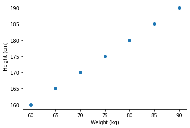
This code will create a scatter plot of weight vs. height. However, there is no trend line on the plot yet.
Step 4: Add a Trend Line
To add a trend line, we need to use NumPy’s polyfit() function. This function fits a polynomial of a specified degree to the data and returns the coefficients of the polynomial. We will use this function to fit a straight line to the data.
# Plot data and set labels
plt.scatter(df['Weight'], df['Height'])
plt.xlabel('Weight (kg)')
plt.ylabel('Height (cm)')

# Fit the trend line
z = np.polyfit(data['Weight'], data['Height'], 1)
p = np.poly1d(z)
plt.plot(data['Weight'],p(data['Weight']),"r--")

# Show the plot
plt.show()
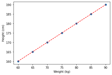
The polyfit() function takes three arguments: the x-axis values, the y-axis values, and the degree of the polynomial. In this case, we are fitting a straight line, so the degree is set to 1.
The poly1d() function creates a polynomial object that we can use to evaluate the polynomial at different x-values.
Finally, we use the plot() method to plot the trend line. We pass the x-axis values and the polynomial object as arguments to the plot() method. We also set the line style to “r–” to make the trend line dashed and red.
Full code
Now that we have added the trend line, we can display the plot using the show() method.
# Import libraries
import matplotlib.pyplot as plt
import numpy as np
import pandas as pd

# Read data
data = pd.read_csv('data.csv')

# Plot data and set labels
plt.scatter(df['Weight'], df['Height'])
plt.xlabel('Weight (kg)')
plt.ylabel('Height (cm)')

# Fit the trend line
z = np.polyfit(data['Weight'], data['Height'], 1)
p = np.poly1d(z)
plt.plot(data['Weight'],p(data['Weight']),"r--")

# Show the plot
plt.show()
This code will display the scatter plot with the trend line.
Conclusion
In this article, we have shown you how to draw a scatter trend line on Matplotlib using Python Pandas. We started by explaining what a scatter trend line is and why it is useful. We then provided a step-by-step guide on how to draw a scatter trend line on Matplotlib. By following these steps, you can easily create scatter plots with trend lines in Python.

