
This article was published when data science tooling like Dask and R was a primary focus for Saturn Cloud. Today, Saturn Cloud is the enterprise AI platform for any GPU infrastructure.
As a data scientist or software engineer, drawing a distribution of a column is a fundamental task that we often encounter in data analysis. Pandas is a powerful Python library that provides a range of functions for working with data and drawing visualizations. In this article, we will explore how to draw a distribution of a column in Pandas.
Table of Contents
- What is a Distribution?
- How to Draw a Distribution of a Column
- Customizing the Histogram
- Common Errors and How to Handle Them
- Conclusion
What is a Distribution?
Before we dive into the details of drawing a distribution of a column, let’s first define what a distribution is. In statistics, a distribution is a function that describes the likelihood of different outcomes in a random variable. In other words, it shows how the values of a variable are spread out or clustered around a central value. Common types of distributions include normal, binomial, Poisson, and exponential distributions.
How to Draw a Distribution of a Column
To draw a distribution of a column in Pandas, we will use the hist function, which creates a histogram of the values in a column. A histogram is a graphical representation of the distribution of a dataset. It groups the values into bins and displays the frequency of those bins as bars.
Let’s start by importing the necessary libraries and reading in a dataset:
import pandas as pd
import matplotlib.pyplot as plt

# read in the dataset
df = pd.read_csv('data.csv')
Now, let’s say we want to draw a distribution of the age column in our dataset. We can do this by calling the hist function on the age column:
# draw a histogram of the age column
df['age'].hist()

# add labels and title
plt.xlabel('Age')
plt.ylabel('Frequency')
plt.title('Distribution of Age')
This will create a histogram of the values in the age column, with the x-axis representing the age values and the y-axis representing the frequency of those age values.
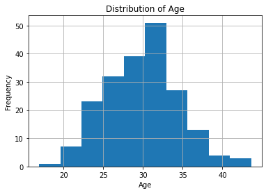
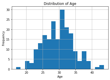
As you can see, the hist function automatically divides the age values into bins and displays the frequency of those bins as bars. By default, it uses 10 bins, but you can adjust this by passing in the bins parameter. For example, to use 20 bins, you can do:
# draw a histogram of the age column with 20 bins
df['age'].hist(bins=20)

# add labels and title
plt.xlabel('Age')
plt.ylabel('Frequency')
plt.title('Distribution of Age')
Customizing the Histogram
The hist function provides a range of customization options to adjust the appearance of the histogram. For example, you can change the color of the bars, add a grid, adjust the axis limits, and more.
Here are some examples of how you can customize the histogram:
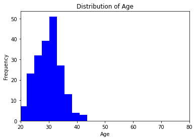
# draw a histogram with blue bars and a grid
df['age'].hist(color='blue', grid=False)

# add labels and title
plt.xlabel('Age')
plt.ylabel('Frequency')
plt.title('Distribution of Age')

# set the x-axis limits to show only ages between 20 and 80
plt.xlim(20, 80)
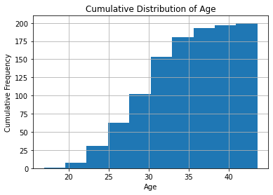
# draw a cumulative histogram of the age column with 10 bins
df['age'].hist(bins=10, cumulative=True)

# add labels and title
plt.xlabel('Age')
plt.ylabel('Cumulative Frequency')
plt.title('Cumulative Distribution of Age')
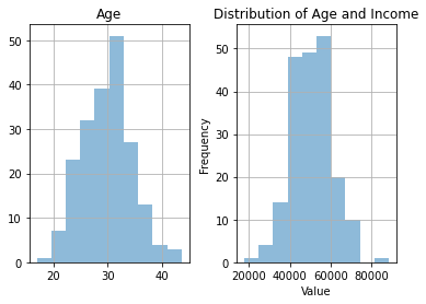
Note that you can also combine multiple histograms on the same plot by calling the hist function on different columns and passing in the alpha parameter to adjust the transparency of the bars. For example:
# draw histograms of the age and income columns on the same plot
df[['age', 'income']].hist(alpha=0.5)

# add labels and title
plt.xlabel('Value')
plt.ylabel('Frequency')
plt.title('Distribution of Age and Income')
Common Errors and How to Handle Them
Error 1: Missing Data
If your dataset contains missing values, Pandas may throw errors. Handle this by dropping or imputing missing values:
df['Age'].dropna().plot(kind='hist', bins=10, color='skyblue', edgecolor='black')
Error 2: Incorrect Data Types
Ensure the ‘Age’ column is of the correct data type. Convert it if needed:
df['Age'] = pd.to_numeric(df['Age'], errors='coerce')
Error 3: Outliers
Address outliers to get a clearer distribution:
df = df[df['Age'] < 100] # Remove ages greater than 100
Error 4: Choosing the Wrong Visualization
Choosing the wrong plot can mislead. Consider a boxplot for a better view of the distribution and outliers:
sns.boxplot(x=df['Age'])
Conclusion
Drawing a distribution of a column in Pandas is a simple and powerful way to visualize the spread of values in a dataset. With the hist function, you can quickly create histograms of your data and customize them to suit your needs. We hope this article has been helpful in showing you how to draw a distribution of a column in Pandas.
