
This article was published when data science tooling like Dask and R was a primary focus for Saturn Cloud. Today, Saturn Cloud is the enterprise AI platform for any GPU infrastructure.
As a data scientist, you may often find yourself working with large datasets and need to visualize them in a way that is easy for others to understand. One common way of doing this is by using boxplots, which can provide a quick and clear understanding of the distribution of data. In this article, we will explore how to create a side-by-side boxplot of multiple columns in a Pandas DataFrame. We will walk you through the steps to create a boxplot that can help you understand the distribution of your data and make informed decisions.
Table of Contents
- What is a Boxplot?
- Creating a Side-by-Side Boxplot of Multiple Columns in a Pandas DataFrame
- Common Errors and How to Handle Them
- Conclusion
What is a Boxplot?
A boxplot is a graphical representation of the distribution of data based on five summary statistics: minimum, first quartile (Q1), median, third quartile (Q3), and maximum. It is also known as a box-and-whisker plot. The box represents the interquartile range (IQR), which is the distance between the first and third quartiles. The whiskers extend from the box to the minimum and maximum values within the range of 1.5 times the IQR. Any data points outside this range are plotted as outliers.
Creating a Side-by-Side Boxplot of Multiple Columns in a Pandas DataFrame
To create a side-by-side boxplot of multiple columns in a Pandas DataFrame, we will use the boxplot() function. This function is part of the matplotlib library, which is a powerful tool for data visualization. Here are the steps to create a side-by-side boxplot of multiple columns in a Pandas DataFrame:
Step 1: Import the Required Libraries
Before we start, we need to import the required libraries. We will be using Pandas and Matplotlib for this task. Here is the code to import them:
import pandas as pd
import matplotlib.pyplot as plt
Step 2: Load Your Data
Load your data into a Pandas DataFrame. For this example, we will use a sample dataset from Seaborn library.
import seaborn as sns
df = sns.load_dataset('iris')
Step 3: Choose Columns to Plot
Choose the columns that you want to plot. In this example, we will plot the ‘sepal_length’, ‘sepal_width’, ‘petal_length’, and ‘petal_width’ columns from the iris dataset.
data_to_plot = df[['sepal_length', 'sepal_width', 'petal_length', 'petal_width']]
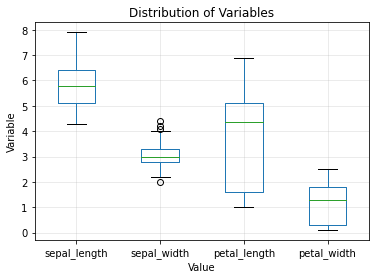
Step 4: Create the Boxplot
Use the boxplot() function to create the boxplot.
data_to_plot.boxplot()
Step 5: Customize the Plot
Customize the plot to make it more informative and visually appealing. Some of the customizable parameters include xlabel, ylabel, title, and grid. Here’s an example of how you can customize the plot:
plt.xlabel('Value')
plt.ylabel('Variable')
plt.title('Distribution of Variables')
plt.grid(alpha=0.3)
plt.show()
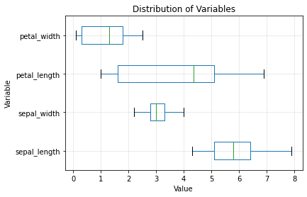
We can also adjust the boxplot by specifying additional parameters such as vert=False for a horizontal boxplot and showfliers=False to hide any outliers. Here’s the updated code:
data_to_plot.boxplot(vert=False, showfliers=False)
Common Errors and How to Handle Them
Error 1: Missing Data
# Check for missing data
print(iris.isnull().sum())

# Handle missing data (replace NaN with mean)
iris.fillna(iris.mean(), inplace=True)
Error 2: Incorrect Data Types
# Ensure correct data types for numerical columns
iris['sepal_length'] = pd.to_numeric(iris['sepal_length'])
Error 3: Plotting Mismatched Data
# Ensure the correct column names are used
sns.boxplot(x='species', y='invalid_column', data=iris)
Conclusion
Boxplots are a powerful tool for visualizing the distribution of data. With Pandas and Matplotlib, it is easy to create a side-by-side boxplot of multiple columns in a Pandas DataFrame. By following the steps outlined in this article, you can create informative and visually appealing boxplots that can help you make informed decisions based on your data.

