This article was published when data science tooling like Dask and R was a primary focus for Saturn Cloud. Today, Saturn Cloud is the enterprise AI platform for any GPU infrastructure.
Data science model deployment can sound intimidating if you have never had a chance to try it in a safe space. Do you want to make a REST API, or a full frontend app? What does it take to do either of these? It’s not as hard as you might think!
In this three-part series of posts, we’re going to go through how you can take a model and deploy it to a web app or a REST API (using Saturn Cloud), so that others can interact with it. In this app, we’ll let the user make some feature selections and then the model will predict an outcome for them. But using this same idea, you could easily do other things, such as letting the user retrain the model, upload things like images, or conduct other interactions with your model.
Just to be interesting, we’re going to do this same project with two frameworks, Voila and Flask, so you can see how they both work and decide what’s right for your needs. In Flask, we’ll create both a REST API and a web app version.
Our Toolkit
- Saturn Cloud (so you can deploy easily!)
- Flask
- Voila
- Plotly (python and JS)
- Scikit-learn (for our model)
Other Helpful Links
- ipywidgets (helpful for Voila)
- codebook for the dataset
- plotly.js cheat sheet
- Jinja (helpful for Flask)
The Project
The first steps of our process are exactly the same whether we are going for Voila or Flask. We need to get some data and build a model! I am going to take the US Department of Education’s College Scorecard data, and build a quick linear regression model that accepts a few inputs and predicts a student’s likely earnings 2 years after graduation. (You can get this data yourself at https://collegescorecard.ed.gov/data/)
About Measurements
According to the data codebook: “The cohort of evaluated graduates for earnings metrics consists of those individuals who received federal financial aid, but excludes those who were subsequently enrolled in school during the measurement year, died prior to the end of the measurement year, received a higher-level credential than the credential level of the field of study measured, or did not work during the measurement year.”from sklearn.model_selection import train_test_split
from sklearn.experimental import enable_iterative_imputer
from sklearn.impute import IterativeImputer
from sklearn.preprocessing import OneHotEncoder
from sklearn.pipeline import Pipeline
from sklearn.compose import ColumnTransformer
from sklearn import linear_model
import [pandas](https://saturncloud.io/glossary/pandas) as pd
import [numpy](https://saturncloud.io/glossary/numpy) as np
import s3fs
import plotly
import plotly.graph_objects as go
# Flask app imports
from flask import Flask, render_template, request, jsonify
import json
# Voila app imports
from IPython.core.display import display, HTML
import ipywidgets as widgets
from ipywidgets import GridBox, Layout
Load Data
I already did some data cleaning and uploaded the features I wanted to a public bucket on S3, for easy access. This way, I can load it quickly when the app is run.
def load_data():
    s3 = s3fs.S3FileSystem(anon=True)
    s3fpath = 's3://saturn-public-data/college-scorecard/cleaned_merged.csv'

    major = pd.read_csv(
        s3fpath,
        storage_options={'anon': True},
        dtype = 'object',
        na_values = ['PrivacySuppressed']
    )
    return major
Format for Training
Once we have the dataset, this is going to give us a handful of features and our outcome. We just need to split it between features and target with scikit-learn to be ready to model. (Note that all of these functions will be run exactly as written in each of our apps.)
def split_data(df):

    X = df[['SAT_AVG_ALL','CREDDESC', 'CIPDESC_new','CONTROL',
            'REGION', 'tuition', 'LOCALE', 'ADM_RATE_ALL']]
    y = df[['EARN_MDN_HI_2YR']]

    return [X, y]
Our features are:
- REGION: Geographic location of college
- LOCALE: Type of city or town the college is in
- CONTROL: Type of college (public/private/for-profit)
- CIPDESC_new: Major field of study (CIP code)
- CREDDESC: Credential (Bachelor, Master, etc)
- ADM_RATE_ALL: Admission rate
- SAT_AVG_ALL: Average SAT score for admitted students (proxy for college prestige)
- tuition: Cost to attend the institution for one year
Our target outcome is EARN_MDN_HI_2YR: median earnings measured two years after completion of degree.
Train Model
We are going to use scikit-learn’s pipeline to make our feature engineering as easy and quick as possible. We’re going to return a trained model as well as the R-squared value for the test sample, so we have a quick and straightforward measure of the model’s performance on the test set that we can return along with the model object.
def trainmodel(X, y):
    enc = OneHotEncoder(handle_unknown='ignore', sparse = False)
    imp = IterativeImputer(max_iter=10, random_state=0, initial_strategy='mean', add_indicator = True)

    X_train, X_test, y_train, y_test = train_test_split(X, y, test_size=0.15, random_state=42)

    ct = ColumnTransformer(
        [('onehot', enc, ['CONTROL','CREDDESC', 'CIPDESC_new','REGION', 'LOCALE']),
        ('impute', imp, ['SAT_AVG_ALL', 'ADM_RATE_ALL'])],
        remainder='passthrough'
    )

    pipe = Pipeline(steps=[('coltrans', ct), ('linear', linear_model.LinearRegression())])
    pipe = pipe.fit(X_train, y_train)
    return pipe, pipe.score(X_test,y_test)
Now we have a model, and we’re ready to put together the app! All these functions will be run when the app runs, because it’s so fast that it doesn’t make sense to save out a model object to be loaded. If your model doesn’t train this fast, save your model object and return it in your app when you need to predict.
Visualization
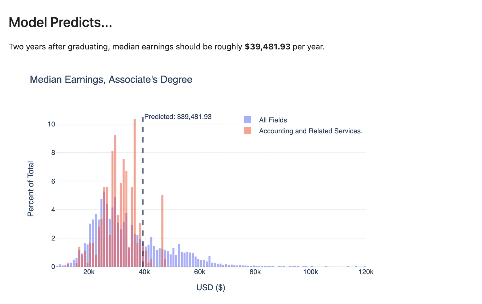
In addition to building a model and creating predictions, we want our app to show a visual of the prediction against a relevant distribution. The same plot function can be used for both apps, because we are using Plotly for the job.
The function below accepts the type of degree and the major, to generate the distributions, as well as the prediction that the model has given. That way, the viewer can see how their prediction compares to others. Later, we’ll see how the different app frameworks use the Plotly object.
def plotly_hist(df, prediction=1, degreetype='All', majorfield = "All Fields"):

    plot_series1 = df[df.CREDDESC == degreetype]['EARN_MDN_HI_2YR'].astype(int)
    plot_series2 = df[(df.CIPDESC_new == majorfield) & (df.CREDDESC == degreetype)]['EARN_MDN_HI_2YR'].astype(int)

    fig = go.Figure()
    fig.add_trace(go.Histogram(x=plot_series1, name = "All Fields", histnorm='percent', xbins=dict(size = 1000)))
    fig.add_trace(go.Histogram(x=plot_series2, name = majorfield, histnorm='percent', xbins=dict(size = 1000)))

    fig.update_layout(
        barmode='overlay',
        title_text=f'Median Earnings, {degreetype}', # title of plot
        xaxis_title_text='USD ($)', # xaxis label
        yaxis_title_text='Percent of Total', # yaxis label
        bargap=0.2, # gap between bars of adjacent location coordinates
        bargroupgap=0.1, # gap between bars of the same location coordinates
        template = "plotly_white",
        font=dict(
            family="Helvetica",
            size=12),
        legend=dict(yanchor = 'top', y=1,
                    xanchor = 'right', x = 1)
    )
    fig.add_vline(x=prediction, line_dash="dash", annotation_text=f"Predicted: ${round(prediction, 2):,}")

    fig.update_traces(opacity=0.55)
    return fig
This is the general visual we’ll be generating — but because it’s Plotly, it’ll be interactive!

You might be wondering whether your favorite other visualization library could work here — the answer is, maybe! Every Python viz library has idiosyncrasies, and is not likely to be supported exactly the same for Voila and Flask. I chose Plotly because it has interactivity and is fully functional in both frameworks, but you are welcome to try your own visualization tool and see how it goes!
Deployment
Now, you’re ready to move on to deploying the model. In Part 2 of this series, you’ll learn to do it with Voila, and in Part 3, you’ll learn the process with Flask.
Thank you to Nathan Dumlao on Unsplash for the header image for this post!


