
This article was published when data science tooling like Dask and R was a primary focus for Saturn Cloud. Today, Saturn Cloud is the enterprise AI platform for any GPU infrastructure.
Matplotlib is a powerful Python library for data visualization, and one of its most useful features is the ability to use colormaps for line plots. This guide will walk you through the process of using a colormap for your matplotlib line plots, enhancing your data visualization skills.
Table of Contents
- What is a Colormap?
- Why Use a Colormap?
- How to Use a Colormap in Matplotlib?
- Choosing the Right Colormap
- Pros and Cons of Using Colormaps for Bar Plots
- Common Errors and How to Handle Them
- Conclusion
What is a Colormap?
A colormap is a range of colors that are used to represent data values in a plot. They are essential for visualizing data in a way that is both aesthetically pleasing and informative. Matplotlib provides a wide variety of colormaps, each designed to convey different types of data.
Why Use a Colormap?
Colormaps can help to differentiate between different data sets, highlight specific areas of interest, and provide a more intuitive understanding of the data. They are particularly useful when dealing with large data sets or when visualizing complex relationships between variables.
How to Use a Colormap in Matplotlib?
Let’s dive into the process of using a colormap in matplotlib. We’ll start by importing the necessary libraries:
import matplotlib.pyplot as plt
import numpy as np
Next, we’ll generate some data to plot. For this example, we’ll use a simple sine wave:
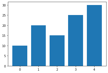
# Generate sample data
data = np.array([10, 20, 15, 25, 30])
Now, let’s create a line plot using the default colormap:
# Choose a colormap
cmap = plt.get_cmap("viridis")

# Plot the bar chart with colormap
plt.bar(range(len(data)), data, color=cmap(data))

# Show the plot
plt.show()
This will create a simple line plot. But what if we want to use a different colormap? We can do this by using the cmap parameter in the plot function. Let’s use the ‘viridis’ colormap:
# Create a custom colormap
custom_cmap = plt.cm.get_cmap("coolwarm", len(data))

# Plot the bar chart with custom colormap
plt.bar(range(len(data)), data, color=custom_cmap(range(len(data))))

# Show the plot
plt.show()
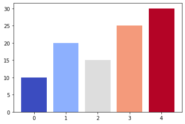
This will create a line plot with the coolwarm colormap. You can experiment with different colormaps to see which one works best for your data.
Choosing the Right Colormap
Choosing the right colormap can be a bit tricky. Matplotlib provides a wide variety of colormaps, each designed to convey different types of data. Here are a few tips to help you choose the right colormap:
- Sequential colormaps: These are suitable for representing continuous data that has a natural progression from low to high.
- Diverging colormaps: These are useful for highlighting deviation from a median value.
- Qualitative colormaps: These are best for categorical data.
You can view all available colormaps in matplotlib by using the matplotlib.pyplot.colormaps() function.
Output:
['magma',
 'inferno',
 'plasma',
 'viridis',
 .
 .
 .
 'tab20c_r']
Pros and Cons of Using Colormaps for Bar Plots
Pros:
- Enhanced Visibility: Colormaps provide a visual cue to the viewer about the magnitude of values, making it easier to identify patterns.
- Aesthetic Appeal: Well-chosen colormaps can make your plots more visually appealing, capturing the audience’s attention.
Cons:
- Color Perception Variation: Interpretation of color can vary among individuals, leading to potential misinterpretation of data.
- Limited Color Range: Some colormaps may not be suitable for certain types of data, limiting the effectiveness of visualization.
Common Errors and How to Handle Them
Error 1: Incorrect Colormap Usage
Choosing the right colormap is crucial to effectively represent your data. The type of data you have should guide your colormap selection:
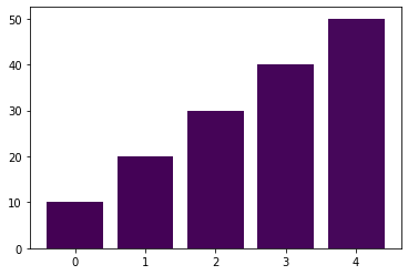
- Sequential Data: Use a sequential colormap when your data represents a range of values with a clear progression or trend. Example:
viridis,plasma. Example:
import matplotlib.pyplot as plt
import numpy as np

# Sequential Data Example
data_seq = np.array([10, 20, 30, 40, 50])
plt.bar(range(len(data_seq)), data_seq, color=plt.cm.viridis(data_seq))
plt.show()
- Diverging Data: If your data has distinct high and low points with a neutral midpoint, opt for a diverging colormap. Example:
coolwarm,RdBu_r.
# Diverging Data Example
data_div = np.array([-20, -10, 0, 10, 20])
plt.bar(range(len(data_div)), data_div, color=plt.cm.coolwarm((data_div - min(data_div)) / (max(data_div) - min(data_div))))
plt.show()
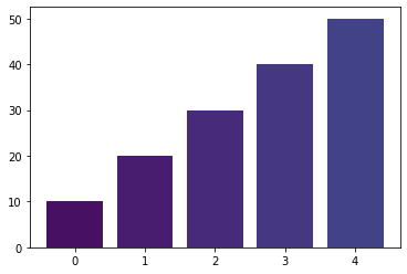
Error 2: Color Mismatch
Incorrect color assignments can lead to misinterpretation of data. Ensure that the colors assigned to bars accurately represent the corresponding data values. Avoid using too many colors that might cause confusion.
Example:
import matplotlib.pyplot as plt
import numpy as np

data = np.array([10, 20, 30, 40, 50])

# Incorrect color assignment
plt.bar(range(len(data)), data, color=plt.cm.viridis(range(len(data))))
plt.show()
In the above example, colors are assigned based on the index rather than the actual data values, resulting in a mismatch between the colors and the data.
# Correct color assignment
plt.bar(range(len(data)), data, color=plt.cm.viridis(data_seq))
plt.show()
Conclusion
Using a colormap for matplotlib line plots is a powerful tool for data visualization. It can help to differentiate between different data sets, highlight specific areas of interest, and provide a more intuitive understanding of the data. With a wide variety of colormaps available, you can find the perfect one to represent your data.
Remember, the key to effective data visualization is not just about making your plots look good, but also about conveying the right information in an understandable way. So, experiment with different colormaps and see which one works best for your data.
