
Matplotlib is a powerful Python library that allows data scientists to create a wide variety of static, animated, and interactive plots. In this blog post, we will focus on a simple yet essential aspect of data visualization: plotting a horizontal line. This guide is optimized for data scientists who want to enhance their data visualization skills.
Table of Contents
- Introduction to Matplotlib
- Why Plot a Horizontal Line?
- Getting Started with Matplotlib
- Plotting a Horizontal Line
- Customizing the Horizontal Line
hlinesMethod for Multiple Lines- Common Errors and Solutions
- Conclusion
Introduction to Matplotlib
Matplotlib is a multi-platform data visualization library built on NumPy arrays and designed to work with the broader SciPy stack. It was conceived by John Hunter in 2002 as an open-source Python library for plotting 2D graphics.
Why Plot a Horizontal Line?
Plotting a horizontal line may seem trivial, but it’s a fundamental skill in data visualization. Horizontal lines are often used to indicate a benchmark or target value in a graph, or to highlight a specific value across different categories in a bar chart.
Getting Started with Matplotlib
Before we dive into plotting a horizontal line, let’s ensure that you have Matplotlib installed. If not, you can install it using pip:
pip install matplotlib
Or, if you’re using Anaconda:
conda install matplotlib
Plotting a Horizontal Line
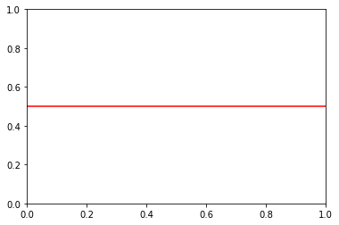
To plot a horizontal line, we’ll use the axhline() function. This function draws a horizontal line across the entire x-axis. Here’s a simple example:
import matplotlib.pyplot as plt

plt.axhline(y=0.5, color='r', linestyle='-')
plt.show()
In this example, y=0.5 sets the position of the line across the y-axis, color='r' sets the color of the line to red, and linestyle='-' sets the line style to a solid line. The plt.show() function displays the plot.
Customizing the Horizontal Line
Matplotlib allows you to customize the horizontal line to suit your needs. You can change the line’s width, style, and color, and you can also add labels.
Changing Line Width and Style
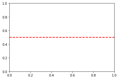
To change the line width, use the linewidth or lw parameter. To change the line style, use the linestyle or ls parameter. Here’s an example:
plt.axhline(y=0.5, color='r', linestyle='--', linewidth=2)
plt.show()
In this example, linewidth=2 sets the line width to 2, and linestyle='--' sets the line style to a dashed line.
Adding a Label
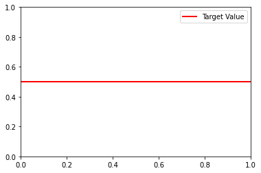
To add a label to the line, use the label parameter. You can display the label by calling plt.legend(). Here’s an example:
plt.axhline(y=0.5, color='r', linestyle='-', linewidth=2, label='Target Value')
plt.legend()
plt.show()
In this example, label='Target Value' sets the label of the line, and plt.legend() displays the legend.
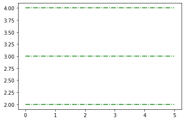
hlines Method for Multiple Lines
If you need to draw multiple horizontal lines, the hlines method is convenient. It takes an array of y-values, making it easy to plot several lines at once:
y_values = [2, 3, 4]
plt.hlines(y_values, xmin=0, xmax=5, colors='g', linestyles='dotted', label='Multiple Lines')
plt.show()
Common Errors and Solutions:
Error 1:
AttributeError: 'module' object has no attribute 'axhline'- Solution: Ensure that you have correctly imported Matplotlib. The
axhlinemethod is part of thepyplotmodule.
import matplotlib.pyplot as plt- Solution: Ensure that you have correctly imported Matplotlib. The
Error 2:
ValueError: 'ymin' cannot be >= 'ymax'- Solution: Check the values you provided for
yminandymaxparameters in thehlinesmethod. Ensure thatyminis less thanymax.
plt.hlines(y_values, xmin=0, xmax=5, colors='g', linestyles='dotted', label='Multiple Lines')- Solution: Check the values you provided for
Error 3:
TypeError: unsupported operand type(s) for /: 'str' and 'int'- Solution: Verify that numerical values are used where required. In the code snippet below, ensure that the y-value is a number.
plt.axhline(y=3, color='b', linestyle='-', linewidth=2, label='Custom Line')
Conclusion
Plotting a horizontal line is a fundamental skill in data visualization. It allows you to highlight specific values, indicate benchmarks, or draw attention to particular data points. With Matplotlib, you can easily plot and customize horizontal lines to suit your needs.
