
This article was published when data science tooling like Dask and R was a primary focus for Saturn Cloud. Today, Saturn Cloud is the enterprise AI platform for any GPU infrastructure.
Data visualization is a critical aspect of data science. It allows us to understand complex data sets and draw insights from them. One of the most popular libraries for data visualization in Python is Matplotlib. In this blog post, we’ll focus on a specific aspect of Matplotlib - creating bar charts and spacing out bars for better readability and aesthetics.
Table of Contents
- Introduction to Matplotlib
- Why Space Out Bars in a Bar Chart?
- Creating a Basic Bar Chart
- Spacing Out Bars in a Bar Chart
- Customizing Bar Spacing
- Common Errors and Solutions
- Best Practices
- Conclusion
Introduction to Matplotlib
Matplotlib is a powerful Python library used for creating static, animated, and interactive visualizations in Python. It provides a high-level interface for drawing attractive and informative statistical graphics.
Why Space Out Bars in a Bar Chart?
When dealing with multiple categories in a bar chart, the bars can often be too close together, making the chart difficult to read. Spacing out bars can significantly improve the readability and aesthetics of your bar chart.
Creating a Basic Bar Chart
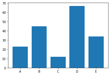
Before we dive into spacing out bars, let’s first create a basic bar chart.
import matplotlib.pyplot as plt

# Data
categories = ['A', 'B', 'C', 'D', 'E']
values = [23, 45, 12, 67, 34]

# Create bar chart
plt.bar(categories, values)
plt.show()
This code will generate a simple bar chart with the categories on the x-axis and their corresponding values on the y-axis.
Spacing Out Bars in a Bar Chart
Now, let’s space out the bars in our bar chart. We can do this by modifying the width parameter in the plt.bar() function.
# Create spaced out bar chart
plt.bar(categories, values, width=0.5)
plt.show()
By setting the width parameter to a value less than 1, we reduce the width of the bars, thereby increasing the space between them.

Customizing Bar Spacing
For more control over the spacing of the bars, we can use the numpy library’s arange function to generate our x-values and then adjust the spacing as needed.
import numpy as np

# Generate x-values
x_values = np.arange(len(categories))

# Create bar chart with custom spacing
plt.bar(x_values, values, width=0.5)

plt.show()
In this code, we generate numerical x-values using np.arange(), which we then use to create the bar chart.
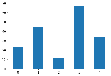
import numpy as np

# Generate x-values
x_values = np.arange(len(categories))

# Create bar chart with custom spacing
plt.bar(x_values, values, width=0.5)

# Replace numerical x-values with category labels
plt.xticks(x_values, categories)
plt.show()
We then replace the numerical x-values with our category labels using plt.xticks().

Common Errors and Solutions
Incorrect Width Parameter:
- Error: Setting an inappropriate value for the
widthparameter can lead to distorted bar charts. - Solution: Ensure that the
widthvalue is reasonable; it should be a positive number less than 1. Experiment with different values to find the optimal spacing for your specific data.
- Error: Setting an inappropriate value for the
Mismatched Data Lengths:
- Error: If the length of your category labels (e.g.,
categories) and corresponding values (e.g.,values) arrays is not the same, it will result in a ValueError. - Solution: Double-check and ensure that the lengths of both arrays are identical. The number of categories should match the number of values you are plotting.
- Error: If the length of your category labels (e.g.,
Incorrect Usage of xticks:
- Error: Using
plt.xticks()without providing the corresponding x-values can result in misaligned labels. - Solution: Ensure that you pass both the x-values and the corresponding labels to
plt.xticks(x_values, categories)to correctly match the labels with their respective bars.
- Error: Using
Best Practices
Optimal Bar Width:
- Choose a reasonable width for your bars to strike a balance between aesthetics and readability. Experiment with different values to find the one that provides sufficient separation between bars without making them too thin or too thick.
Consistent Color Scheme:
- Maintain a consistent color scheme for your bars to enhance visual clarity. Using a variety of colors may confuse the viewer and distract from the actual data. Consider using a single color or a gradient that makes sense for your data.
Labeling Axes Appropriately:
- Clearly label the x and y axes of your bar chart. Inadequate or missing axis labels can lead to confusion about the data being presented.
Meaningful Category Labels:
- Use descriptive and meaningful labels for your categories. Labels that are too short or unclear can diminish the overall understanding of the chart.
Conclusion
Spacing out bars in a Matplotlib bar chart can greatly improve the readability and aesthetics of your data visualizations. By adjusting the width parameter or using numpy to generate custom x-values, you can easily control the spacing of your bars.
Remember, effective data visualization is not just about presenting data; it’s about making it understandable and insightful. So, take the time to fine-tune your visualizations for maximum impact.
