
How to Set X-Axis Values in Matplotlib Python: A Guide
Python’s Matplotlib is a powerful tool for data visualization, enabling data scientists to create a wide range of static, animated, and interactive plots. One of the most common tasks when creating these plots is setting the x-axis values. This blog post will guide you through the process of setting x-axis values in Matplotlib, ensuring your plots are as informative and accurate as possible.
What is Matplotlib?
Matplotlib is a plotting library for the Python programming language. It provides an object-oriented API for embedding plots into applications using general-purpose GUI toolkits like Tkinter, wxPython, Qt, or GTK. Matplotlib is also a popular choice for creating complex plots for scientific publications.
Why is Setting X-Axis Values Important?
Setting x-axis values is crucial for accurately representing data. The x-axis serves as the horizontal baseline for your plot, and the values along this axis correspond to the data points in your plot. By correctly setting these values, you ensure that your data is represented accurately and meaningfully.
How to Set X-Axis Values in Matplotlib
Let’s dive into the process of setting x-axis values in Matplotlib.
Step 1: Import Necessary Libraries
First, we need to import the necessary libraries. We’ll need Matplotlib and NumPy for this task.
import matplotlib.pyplot as plt
import numpy as np
Step 2: Create Data
Next, we’ll create some data to plot. For this example, we’ll use NumPy to generate an array of numbers.
x = np.linspace(0, 10, 100)
y = np.sin(x)
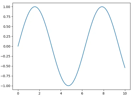
Step 3: Create a Basic Plot
Now, we’ll create a basic plot using the plot function from Matplotlib.
plt.plot(x, y)
plt.show()
Step 4: Set X-Axis Values
To set the x-axis values, we use the xticks function. This function takes two arguments: the locations along the x-axis where the ticks will be placed, and the labels for these ticks.
plt.plot(x, y)
plt.xticks(np.arange(0, 11, step=1))
plt.show()
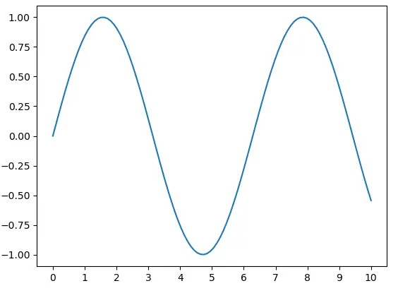
In this example, np.arange(0, 11, step=1) generates an array of numbers from 0 to 10 (inclusive) with a step of 1. These numbers are then used as the locations for the x-axis ticks.
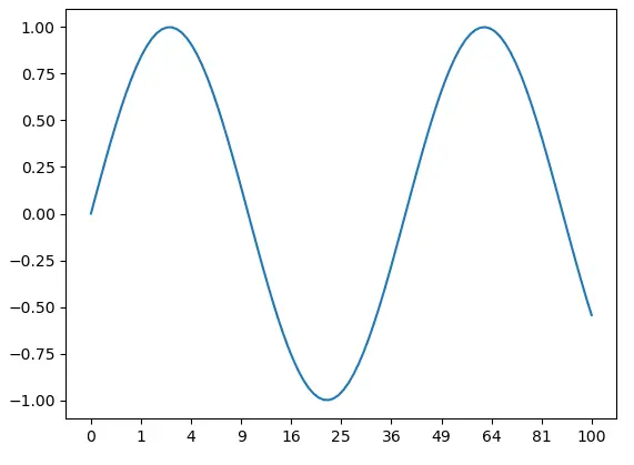
Step 5: Customize X-Axis Labels
You can also customize the labels for the x-axis ticks. For example, you can use the following code to label the ticks with the corresponding values squared.
plt.plot(x, y)
plt.xticks(np.arange(0, 11, step=1), labels=[str(i**2) for i in range(11)])
plt.show()
Conclusion
Setting x-axis values in Matplotlib is a straightforward process, but it’s crucial for creating accurate and meaningful plots. By following the steps outlined in this guide, you can ensure that your plots accurately represent your data.
Remember, data visualization is a powerful tool for data analysis and communication. By mastering tools like Matplotlib, you can make your data tell a compelling story.
