
This article was published when data science tooling like Dask and R was a primary focus for Saturn Cloud. Today, Saturn Cloud is the enterprise AI platform for any GPU infrastructure.
Table of Contents
- Setting the Stage: Understanding Matplotlib Subplots
- Adding X-Axis Labels to Each Subplot
- Customizing X-Axis Labels
- Common Errors
- Conclusion
Setting the Stage: Understanding Matplotlib Subplots
Before diving into the specifics of labeling, it’s crucial to understand what subplots are and how they work in Matplotlib. A subplot is essentially a plot that exists within a larger plot, known as a figure. You can have multiple subplots within a single figure, each with its own axes and plot elements.
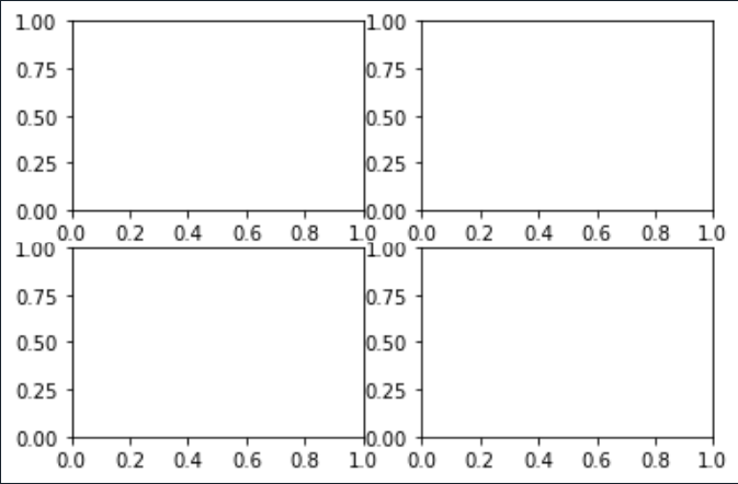
Creating subplots in Matplotlib is straightforward. You can use the subplot() function, which takes three arguments: the number of rows, the number of columns, and the index of the current plot.
import matplotlib.pyplot as plt

# Create a figure and a set of subplots
fig, axs = plt.subplots(2, 2)
plt.show()
The output should look like this:
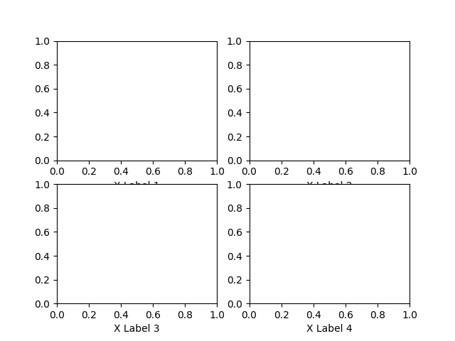
Adding X-Axis Labels to Each Subplot
Now that we have our subplots, let’s add x-axis labels to each one. This can be done using the set_xlabel() function, which is a method of the Axes object in Matplotlib.
# Add x-axis labels
axs[0, 0].set_xlabel('X Label 1')
axs[0, 1].set_xlabel('X Label 2')
axs[1, 0].set_xlabel('X Label 3')
axs[1, 1].set_xlabel('X Label 4')

plt.show()
Now we have labels for each subplot as shown below
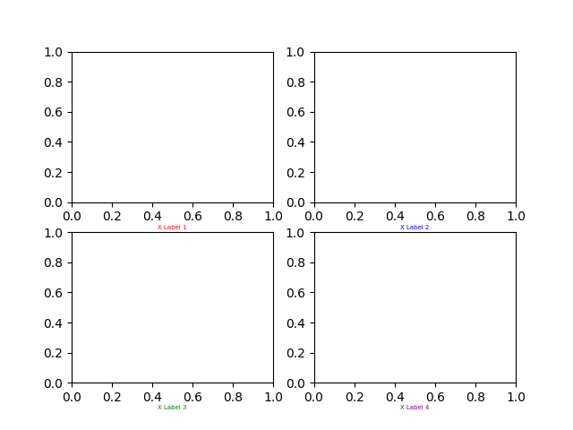
Customizing X-Axis Labels
Matplotlib also allows you to customize the appearance of your x-axis labels, in case they are not lookig very nice like above. You can change the font size, color, and other properties using the labelpad, fontsize, and color parameters of the set_xlabel() function.
# Customize x-axis labels
axs[0, 0].set_xlabel('X Label 1', labelpad=10, fontsize=12, color='red')
axs[0, 1].set_xlabel('X Label 2', labelpad=10, fontsize=12, color='blue')
axs[1, 0].set_xlabel('X Label 3', labelpad=10, fontsize=12, color='green')
axs[1, 1].set_xlabel('X Label 4', labelpad=10, fontsize=12, color='purple')

plt.show()
After the customization our subplots look like this:
Common Errors
Incorrect Number of Labels: Match the number of labels to the number of subplots.
Overlapping Labels: Adjust label placement with labelpad or consider rotating labels for tight spaces.
Incorrect Axes Access: Ensure you’re using the correct Axes object for each subplot. Access them using axs[row, column].
Conclusion
Labeling the x-axis of each subplot in Matplotlib is a simple yet crucial step in creating clear and informative data visualizations. By using the set_xlabel() function, you can not only add labels to your subplots but also customize their appearance to suit your needs.
Remember, effective data visualization is not just about presenting data; it’s about telling a story. And clear, descriptive labels are an essential part of that story.
In the world of data science, Matplotlib is a powerful ally. Mastering its features, such as subplots and labeling, can significantly enhance your data visualization skills. So keep exploring, keep learning, and keep visualizing!
