
This article was published when data science tooling like Dask and R was a primary focus for Saturn Cloud. Today, Saturn Cloud is the enterprise AI platform for any GPU infrastructure.
As a data scientist, it’s crucial to understand how to visualize data effectively. Scatter plots are a popular way to represent data points in a two-dimensional space, making it easy to identify correlations and trends. However, when dealing with a dataset with many columns, it can be challenging to create an informative scatter plot. In this article, we will explore how to create a scatter plot from a Pandas DataFrame with many columns, using Python.
Table of Contents
- What is a scatter plot?
- Why use a scatter plot?
- Creating a scatter plot from a Pandas DataFrame
- Adding additional columns to the scatter plot
- Conclusion
What is a scatter plot?
A scatter plot is a type of plot that displays data points as individual dots. Each dot represents a value for two variables, one plotted along the x-axis and the other plotted along the y-axis. The resulting plot can help identify patterns, trends, and correlations between the two variables. Scatter plots are useful for identifying relationships between continuous variables.
Why use a scatter plot?
Scatter plots are useful for visualizing data points in a two-dimensional space, making it easy to identify correlations and trends. By plotting two variables against each other, we can see how they are related and if there is a correlation between them. Scatter plots are particularly useful for identifying outliers and groups within the data.
Creating a scatter plot from a Pandas DataFrame
Pandas is a popular data manipulation library in Python. It provides a convenient way to load, manipulate, and analyze data. To create a scatter plot from a Pandas DataFrame, we can use the plot.scatter() method.
First, we need to import the necessary libraries:
import pandas as pd
import matplotlib.pyplot as plt
Next, we will create a sample dataset with random values:
import numpy as np

data = pd.DataFrame({
    'x': np.random.rand(100),
    'y': np.random.rand(100),
    'z': np.random.rand(100),
    'a': np.random.rand(100),
    'b': np.random.rand(100),
    'c': np.random.rand(100),
    'd': np.random.rand(100),
    'e': np.random.rand(100),
    'f': np.random.rand(100),
    'g': np.random.rand(100),
})
In this example, we have created a DataFrame with ten columns, each containing 100 random values.
To create a scatter plot, we can call the plot.scatter() method on our DataFrame:
data.plot.scatter(x='x', y='y')
This will create a scatter plot with x values plotted along the x-axis and y values plotted along the y-axis.
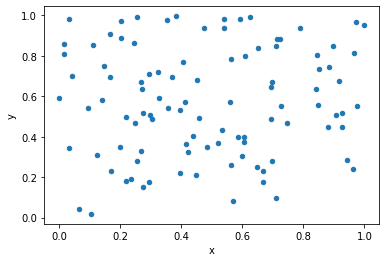
As you can see, the plot displays each data point as a dot, with the x and y values corresponding to the position of the dot on the plot.
Adding additional columns to the scatter plot
When dealing with a dataset with many columns, it can be challenging to create an informative scatter plot. One way to address this issue is by adding additional columns to the scatter plot using color, size, or shape.
For example, we can use the c parameter to add a color map to the scatter plot based on the values in a particular column:
data.plot.scatter(x='x', y='y', c='z', cmap='viridis')
In this example, we used the c parameter to color each data point based on the values in the z column:
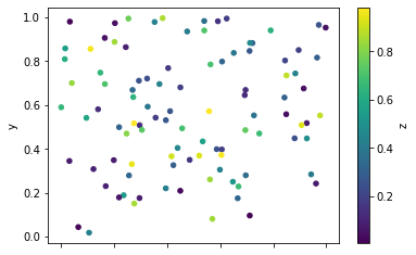
We can see that the color of each dot corresponds to the value in the z column. This makes it easier to identify patterns or trends in the data.
We can also use the s parameter to set the size of each dot based on the values in a particular column:
data.plot.scatter(x='x', y='y', s=data['a']*100)
In this example, we used the s parameter to set the size of each dot based on the values in the a column:
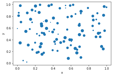
We can see that the size of each dot corresponds to the value in the a column. This can be useful when we want to highlight particular data points in the plot.
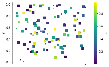
Finally, we can use the marker parameter to set the shape of each dot based on the values in a particular column:
data.plot.scatter(x='x', y='y', c='z', cmap='viridis', s=data['a']*100, marker=data['b'])
In this example, we used the marker parameter to set the shape of each dot to s which means square.
Conclusion
In this article, we explored how to create a scatter plot from a Pandas DataFrame with many columns, using Python. We saw how scatter plots can be useful for identifying patterns, trends, and correlations between two variables. We also learned how to add additional columns to the scatter plot using color, size, or shape. By following these techniques, we can create informative scatter plots that can help us gain insights into our data.

