
This article was published when data science tooling like Dask and R was a primary focus for Saturn Cloud. Today, Saturn Cloud is the enterprise AI platform for any GPU infrastructure.
As a data scientist or software engineer, you may often need to visualize your data to gain insights and communicate your findings to others. One popular way to do this is by creating a histogram, which displays the distribution of a dataset by dividing it into bins and plotting the number of observations in each bin. However, sometimes it’s more informative to display the y-axis of a histogram as a percentage of the total number of observations rather than the raw count. In this blog post, we’ll explore how to create a histogram with a percentage y-axis using Matplotlib and Pandas.
Table of Contents
- Introduction
- What is a Histogram?
- Creating a Histogram with Matplotlib and Pandas
- Creating a Percentage Y-Axis Histogram with Matplotlib and Pandas
- Conclusion
What is a Histogram?
A histogram is a graphical representation of the distribution of a dataset. It is made up of a series of bins, each representing a range of values, and a count of the number of observations that fall into each bin. The x-axis represents the range of values, while the y-axis represents the count or frequency of observations in each bin.
Histograms are commonly used to explore the shape of a dataset, including whether it is symmetric or skewed, whether there are any outliers, and where the majority of the observations fall. They can also be used to compare the distributions of two or more datasets.
Creating a Histogram with Matplotlib and Pandas
Matplotlib is a popular data visualization library in Python that provides a wide variety of tools for creating charts, graphs, and plots. Pandas is a powerful data manipulation library that provides high-level data structures and functions designed to work with tabular data.
To create a histogram with Matplotlib and Pandas, we first need to import the necessary libraries and load our dataset. For this example, we’ll use the Iris dataset, which contains measurements of the sepal length, sepal width, petal length, and petal width for three species of iris flowers.
import matplotlib.pyplot as plt
import pandas as pd
import numpy as np
from sklearn.datasets import load_iris

# Load the Iris dataset from scikit-learn
iris = load_iris()
iris_df = pd.DataFrame(data=iris.data, columns=iris.feature_names)
iris_df['target'] = iris.target
Now that we have our dataset loaded, we can create a histogram of the sepal length using the hist function in Matplotlib.
plt.hist(iris_df['sepal length (cm)'])
plt.show()
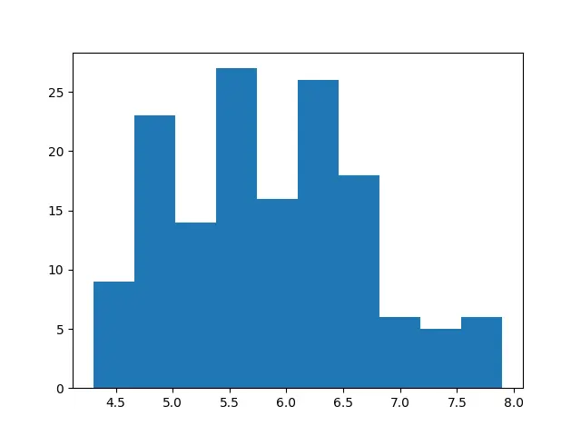
This result of the script above is a histogram with the raw count of observations on the y-axis.
Creating a Percentage Y-Axis Histogram with Matplotlib and Pandas
To create a histogram with a percentage y-axis, we need to divide the count of observations in each bin by the total number of observations in the dataset and multiply by 100 to get the percentage. We can do this using the density parameter in the hist function. Setting density=True normalizes the histogram so that the area under the curve sums to 1, and setting weights to an array of ones of the same shape as x scales the y-axis by the bin width, which we can then multiply by 100 to get the percentage.
plt.hist(iris_df['sepal length (cm)'], density=True, weights=np.ones(len(iris_df['sepal length (cm)'])) / len(iris_df['sepal length (cm)']) * 100)
plt.ylabel('Percentage')
plt.show()
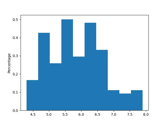
The script above will return a histogram with a percentage y-axis.
Conclusion
In this blog post, we have explored how to create a histogram with a percentage y-axis using Matplotlib and Pandas. Histograms are a powerful tool for visualizing the distribution of a dataset, and by displaying the y-axis as a percentage, we can more easily compare the relative proportions of observations in each bin. We hope this tutorial has been helpful in your data visualization endeavors!
