
This article was published when data science tooling like Dask and R was a primary focus for Saturn Cloud. Today, Saturn Cloud is the enterprise AI platform for any GPU infrastructure.
As a data scientist or software engineer, working with data visualization is an essential part of your job. The ggplot2 package in R is a popular tool for data visualization, which allows you to create high-quality graphs and charts. One of the most common tasks in data visualization is to plot regression lines to analyze the relationship between variables. In this post, we will explain how to change the color of the regression lines in ggplot.
Table of Contents
- Introduction
- What is ggplot?
- How to Plot Regression Lines in ggplot?
- How to Change the Color of the Regression Line in ggplot?
- How to Customize the Regression Line in ggplot?
- Pros and Cons of Customizing Regression Lines in ggplot
- Error Handling
- Conclusion
What is ggplot?
ggplot2 is a popular R package that allows you to create high-quality graphics and charts. It is based on the grammar of graphics, which is a powerful and flexible system for creating visualizations. With ggplot2, you can create a wide range of graphs, including scatterplots, line charts, bar charts, and more.
One of the key features of ggplot2 is its ability to create regression lines. A regression line is a straight line that represents the relationship between two variables. It is commonly used to analyze the correlation between two variables and to predict future values based on the relationship between the variables.
How to Plot Regression Lines in ggplot?
To plot regression lines in ggplot, you first need to create a scatterplot using the ggplot() function. The ggplot() function takes two arguments: the data frame and the aesthetics. The aesthetics specify the variables to be plotted on the x- and y-axes.
library(ggplot2)
data(mtcars)
ggplot(mtcars, aes(x = wt, y = mpg)) +
  geom_point()
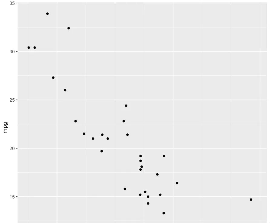
In this example, we are using the mtcars dataset, which contains information about various car models. We are plotting the weight of the car (wt) on the x-axis and the miles per gallon (mpg) on the y-axis.
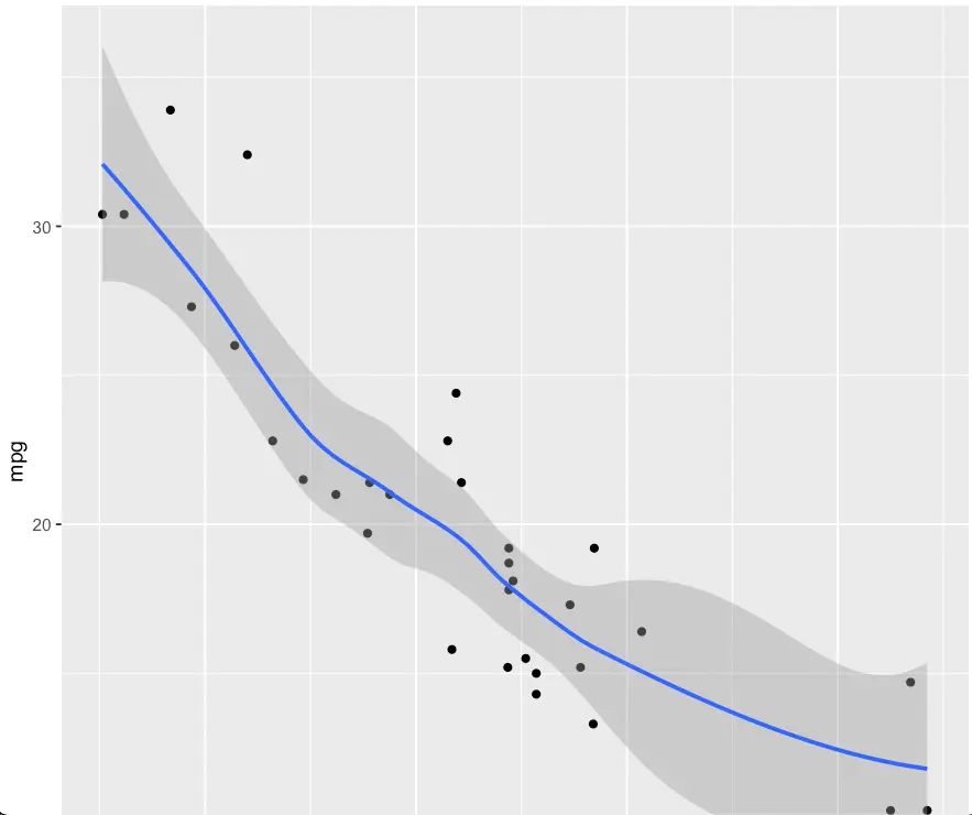
To add a regression line to the scatterplot, you can use the geom_smooth() function. The geom_smooth() function calculates and adds a regression line to the plot. By default, the geom_smooth() function adds a black regression line to the plot.
ggplot(mtcars, aes(x = wt, y = mpg)) +
  geom_point() +
  geom_smooth()
How to Change the Color of the Regression Line in ggplot?
To change the color of the regression line, you can use the color argument in the geom_smooth() function. The color argument specifies the color of the line. You can use any color from the R color palette or specify a custom color using hexadecimal notation.
ggplot(mtcars, aes(x = wt, y = mpg)) +
  geom_point() +
  geom_smooth(color = "red")

In this example, we are changing the color of the regression line to red. You can replace “red” with any other color you want.
How to Customize the Regression Line in ggplot?
In addition to changing the color of the regression line, you can also customize other aspects of the line, such as the line type, line width, and more. You can use the linetype, size, and alpha arguments in the geom_smooth() function to customize the line.
ggplot(mtcars, aes(x = wt, y = mpg)) +
  geom_point() +
  geom_smooth(color = "red", linetype = "dashed", size = 1.5, alpha = 0.5)
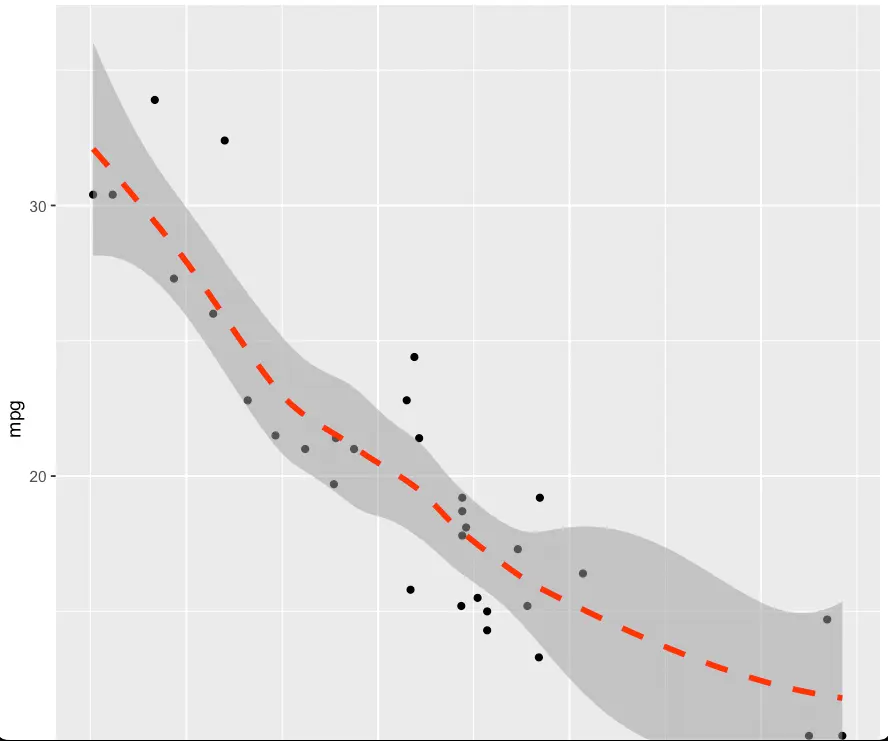
In this example, we are changing the line type to dashed, the line width to 1.5, and the transparency to 0.5.
Pros and Cons of Customizing Regression Lines in ggplot
Pros
- Flexibility and Customization: ggplot2 provides a high level of flexibility and customization, allowing users to create a wide variety of visualizations, including regression lines.
- Ease of Use: The syntax of ggplot2 is relatively intuitive, making it accessible for both beginners and experienced users. Creating complex plots, such as those with regression lines, is made easier through its layered approach.
- Default Aesthetics: The default aesthetics in ggplot2 are well-chosen, providing clear and informative visualizations without requiring extensive customization.
- Wide Range of Plots: ggplot2 supports various plot types beyond scatterplots, making it a versatile choice for exploring and presenting different types of data relationships.
Cons
- Learning Curve: For users new to ggplot2 or R, there can be a learning curve in understanding the grammar of graphics and the various functions involved in creating complex plots.
- Default Color Choices: While ggplot2 offers default colors, they may not always be visually appealing or suitable for publication. Users may need to spend additional time customizing colors to enhance the aesthetics of their visualizations.
- Dependency on R: ggplot2 is specifically designed for R, and users who are not familiar with the R language may find it challenging to integrate ggplot2 into their workflow.
Error Handling
- Missing Data Handling: Users should be cautious about missing data in the variables used for plotting. ggplot2 may not handle missing values gracefully, potentially leading to errors or unintended results.
- Data Type Compatibility: Ensure that the data types of variables specified in aesthetics are appropriate for the plot. Mismatched data types may result in errors or unexpected behavior.
- Library Installation: Before using ggplot2, users need to ensure that the package is installed in their R environment. Failure to install the package may result in functions not being recognized, leading to errors.
- Color Argument Validation: When specifying custom colors, users should validate that the chosen color is valid in the R color palette or using hexadecimal notation. Invalid color specifications may cause errors in rendering the plot.
- Version Compatibility: Check for compatibility issues between the version of ggplot2 being used and the version of R. Upgrading or downgrading packages may be necessary to resolve compatibility-related errors.
Conclusion
In conclusion, ggplot2 is a powerful tool for data visualization, and with a few simple steps, you can easily add regression lines to your plots. By using the geom_smooth() function, you can add a regression line to your scatterplot and customize it to your liking. Changing the color of the regression line is just one of the many customization options available in ggplot2. With a little bit of practice, you can create stunning visualizations that will help you gain insights into your data.

