
This article was published when data science tooling like Dask and R was a primary focus for Saturn Cloud. Today, Saturn Cloud is the enterprise AI platform for any GPU infrastructure.
How to Adjust Tick Spacing in Matplotlib: A Guide for Data Scientists
Matplotlib is a powerful Python library that allows data scientists to create a wide range of static, animated, and interactive plots. One of the most common tasks when using Matplotlib is adjusting the spacing between ticks on your plots. This guide will walk you through the process of changing tick spacing in Matplotlib, ensuring your data visualizations are as clear and informative as possible.
Table of Contents
- Introduction to Matplotlib
- Understanding Ticks in Matplotlib
- Changing Tick Spacing in Matplotlib
- Conclusion
Introduction to Matplotlib
Matplotlib is a multi-platform, data visualization library built on NumPy arrays, and designed to work with the broader SciPy stack. It was conceived by John Hunter in 2002, as an attempt to replicate MatLab’s (another programming language) plotting capabilities in Python. If you’re a data scientist who wants to visualize data in Python, Matplotlib is an essential tool to have in your arsenal.
Understanding Ticks in Matplotlib
In Matplotlib, ticks are the markers denoting data points on axes. They can be both major (larger intervals) and minor (smaller intervals), and are customizable in various ways. You can change their size, rotation, and spacing, among other things. This guide focuses on how to adjust the spacing between these ticks.
Changing Tick Spacing in Matplotlib
To change the spacing between ticks in Matplotlib, you’ll need to use the xticks() and yticks() functions for the x and y axes, respectively. These functions allow you to specify the locations along the axes where the ticks should appear.
Here’s a basic example:
import matplotlib.pyplot as plt
import numpy as np

# Create a simple line plot
x = np.linspace(0, 10, 1000)
y = np.sin(x)
plt.plot(x, y)

# Change x-axis tick spacing
plt.xticks(np.arange(0, 11, step=2))  # ticks at 0, 2, 4, ..., 10

# Change y-axis tick spacing
plt.yticks(np.arange(-1, 1.5, step=0.5))  # ticks at -1, -0.5, 0, 0.5, 1

plt.show()
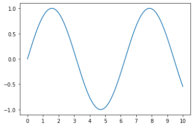
In this example, np.arange() is used to create arrays of values for the tick locations. The step parameter determines the spacing between ticks.
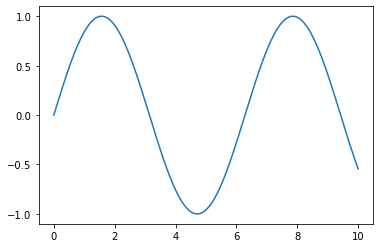
If you want more control over the tick spacing, you can use the MultipleLocator function from the matplotlib.ticker module. This function allows you to set the tick spacing to any multiple of a base number.
Here’s how you can use MultipleLocator:
import matplotlib.pyplot as plt
import matplotlib.ticker as ticker
import numpy as np

# Create a simple line plot
x = np.linspace(0, 10, 1000)
y = np.sin(x)
fig, ax = plt.subplots()
ax.plot(x, y)

# Change x-axis and y-axis tick spacing
ax.xaxis.set_major_locator(ticker.MultipleLocator(base=2))  # x-axis ticks at multiples of 2
ax.yaxis.set_major_locator(ticker.MultipleLocator(base=0.5))  # y-axis ticks at multiples of 0.5

plt.show()
Conclusion
Adjusting the tick spacing in Matplotlib is a crucial step in creating clear and informative data visualizations. By using the xticks(), yticks(), and MultipleLocator() functions, you can easily customize the tick spacing to suit your needs. Remember, the key to effective data visualization is not just about presenting data, but presenting it in a way that is easy to understand. Happy plotting!
Keywords: Matplotlib, Data Visualization, Python, Data Science, Tick Spacing, Matplotlib Ticks, Python Plotting, Matplotlib Tutorial, Adjust Tick Spacing, Data Scientists, Matplotlib Guide

